Brooklyn COVID-19 Cluster Infection Rates By Zip Code Don’t Look So Great

If you feel confused about the ever-changing New York City COVID-19 numbers, you’re not alone. The Mayor stopped reporting COVID19 data for the Brooklyn cluster in his daily briefings earlier this month, and the NYC Department of Health stopped sending out their alerts. They said this was so as not to confuse the public since the reporting would be coming from the Governor’s office on the red-orange-yellow zones. But the result is that there has been no way for the average person to gauge how well their immediate neighborhood is doing.
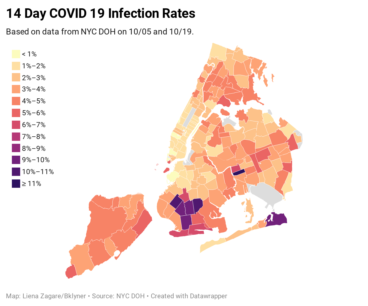
But the data is still public if you dig for it. And so I mapped the data available today from the NYC DOH in a way that’s consistent with the way the city had been counting. When they stopped in early October, some neighborhoods were at 9% positivity.
The data is below, and show that the Brooklyn cluster is still reporting high rates of infection. But these maps come with some qualifiers I want to explain, so you understand what you are looking at, especially since the numbers won’t add up neatly.
The governor is right that the original approach had its flaws when it came to the city’s ability to do targeted response to infection. What’s more, the Mayor played games with the significance of these particular Zip codes having high rates, but it was easy to understand for the city’s residents.
NYC DOH releases daily numbers on COVID-19 cases, which it then shares online daily. These numbers are only somewhat accurate, as the city reports data as of the day of the event, not when it was reported. So if you get tested on October 1, and it takes you 7 days to get your results back, your case will not show up in the data mapped here, as the city will count your case effective October 1, not October 7. Similarly, if you got tested last Thursday and are still awaiting your results, despite having clear symptoms, you will also not be in the data below, as the city is not yet aware you are sick with COVID-19. This is why daily data has limited accuracy, and even weekly data will not catch everyone.
Another issue that this particular data set has struggled with is testing centers incorrectly using their location Zip code instead of the patients, resulting in occasionally overly high numbers that suddenly drop in certain zip codes.
What I did below is pulled data for today, Oct 19, and Oct 12 and Oct 5 – one and two weeks ago, respectively, and calculated the new cases, total tests, and what proportion of tests taken were positive and mapped the results.
See for yourself, and remember – it is the rate of infection among those tested, not everyone within ZIP code. If only those sick get tested, it will skew the real picture:
!function(){"use strict";window.addEventListener("message",(function(a){if(void 0!==a.data["datawrapper-height"])for(var e in a.data["datawrapper-height"]){var t=document.getElementById("datawrapper-chart-"+e)||document.querySelector("iframe[src*='"+e+"']");t&&(t.style.height=a.data["datawrapper-height"][e]+"px")}}))}();
!function(){"use strict";window.addEventListener("message",(function(a){if(void 0!==a.data["datawrapper-height"])for(var e in a.data["datawrapper-height"]){var t=document.getElementById("datawrapper-chart-"+e)||document.querySelector("iframe[src*='"+e+"']");t&&(t.style.height=a.data["datawrapper-height"][e]+"px")}}))}();
Please remember that not all test results are back for those tested in the last 7 days. When you hover over an area in the maps above, you will get more detail on how many of its residents got tested and how many tested positive that we know of.
In fact, we are starting to hear of 6+ day waits to get results from people who got tested in the Brooklyn Cluster area last week. (If you are one of them, please get in touch by emailing editor@bklyner.com).
“Both the citywide median and H+H’s median is at 2 days,” DOH spokesperson Michael Lanza reassured us earlier today, however, data was not readily available for the hot spots, so we will follow up again.
Whichever way one looks at it, the Souther Brooklyn cluster is a very real one, and despite the increased testing, the rates are not dropping dramatically.
The numbers Governor Andrew Cuomo shared this morning say that the red Zone in Brooklyn cluster is now at 5.2% positivity, though he did not say whether that was one day or some other number, and they are defined and calculated in ways that don’t lend to comparisons easily. We are still awaiting clarification. Overall, Brooklyn seems to account for 14% of all infections in New York State.


