What South Slope Subway Stops Say About Household Income

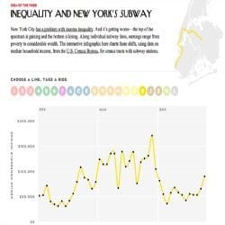

Did you have a chance to play with the oddly addictive graph that The New Yorker released this week? In a recent examination of 2011 US Census, the magazine likens the income gap between the richest 20% and the poorest 20% in the city to that of countries like Sierra Leone, Namibia, and Lesotho.
To help visualize that gap, they’ve put together the above mentioned graph, which shows median income level for every subway station on each line.
Did we mention that it’s oddly addictive?
Here in South Slope, you can see a pretty steep drop in income as the R train runs up 4th Avenue. Around the 4th Avenue/9th Street station, the median household income is $79,000. By the time you get to the Prospect Avenue station, it drops to $56,083, and as you reach 25th Street, it’s fallen to $42,253.
If you’re feeling bored at work, definitely check it out. It’s interesting to see how big of a difference a few blocks can make.