The Need for Better Signage

THE COMMUTE: Last May we discussed subway and bus signage and DOT parking and street signage. In 2011, I wrote about confusing airport signage. Today I will discuss other problems with signage.
Temporary Signage For Detours
I went with four friends last Tuesday evening to see a Broadway play. My friend decided to drive rather take the train due to the rainy weather. Now before I say another word, the anti-automobile crowd is already thinking: “Here comes another complaint about driving in Manhattan and how it should be made easier,” and “This jerk deserves whatever happened to him because he didn’t take the train.”
Well, I’m not going to complain about the traffic or parking because there was nothing to complain about. But there was a problem with signage and it is inexcusable.
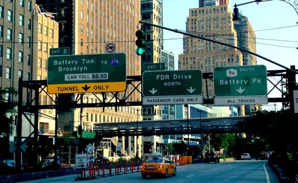
My friend is not a cheapskate, like yours truly, and opted for the Brooklyn Battery Tunnel… Excuse me, I mean the Hugh Carey Tunnel… over the Brooklyn Bridge to save time. On the return trip home we discovered the entrance to the tunnel from West Street was closed. We didn’t know if the entire tunnel was closed or just one entrance, if it was some sort of emergency closing or if it was planned work that necessitated the closure, but there were no signs or detours posted. The entrance was just blocked off.
The most prudent decision seemed to be to continue through the South Street Underpass onto the FDR to the Brooklyn Bridge. Guess what? The entrance to the Brooklyn Bridge was also closed. Again… no detours or signage of any kind. Again… more confusion. Now we know about the Manhattan-bound night closures on the bridge, but why would the entrance to go to Brooklyn be closed also? (The answer only later became apparent after visiting the DOT website.) We then continued to the Houston Street exit and made a U-turn to return to the FDR south-bound. When we arrived at the Brooklyn Bridge again, this time from the southern direction, the normal exit off the FDR was also closed, with no explanation, so we couldn’t even get off to go north on Pearl Street to use the Manhattan Bridge. We were starting to feel like Charlie on the MTA, wondering if we would ever return or would have to wait for someone to hand us a sandwich through the open window.
A few feet later, traffic was directed to make a sharp U-turn. The route somehow meandered its way onto the Brooklyn Bridge, but something didn’t seem right. This exit is not supposed to be there. It seems more like a weird dream than reality. We found ourselves going to Brooklyn on the Manhattan-bound roadway and exited the bridge on the north-bound side of Adams Street in Brooklyn. It is all explained on DOT’s website, how using contra-flow lanes, it is possible to maintain Brooklyn-bound traffic at all times during the Brooklyn Bridge rebuilding, which we had not read prior to making our trip because we never intended to be on the Brooklyn Bridge.
The question remains: How do you close off an entrance to the Hugh Carey Tunnel and two exits to the Brooklyn Bridge without any advance signage advising drivers of a detour? Signage on West Street should have directed Carey Tunnel users to Chambers Street to the Brooklyn Bridge instead of requiring hundreds of cars to travel miles out of their way, adding 15 minutes to their commute. But why should there be adequate signage? Drivers deserve to suffer because they shouldn’t be driving in Manhattan, or so that seems the attitude of DOT. I also love it when signs intentionally mislead. For example, the sign off 31st Street in Astoria that directs BQE users to the Grand Central Parkway service road rather than the main roadway, which saves you three traffic signals.
Electronic Signage
If you drive, you must have noticed the electronic signage on highways, which has appeared in recent years advising of traffic delays. Those signs seem to be malfunctioning more times than they are working, stating public service announcements such as “Buckle Up,” “No Cell Phones” or “Use Mass Transit” instead of providing useful information on road conditions, which is what they were designed to do. We don’t need expensive electronic equipment to provide public service information when stationary signs could do the same thing.
When they do work, I find them to be of limited use, often stating problems that have already been cleared up or understating delays by giving you information for two or three exists at a time when the road is congested for 10 miles. Sometimes the delay information is presented after it is too late to alter your route without providing alternative routes.
A few weeks ago, I was on the Meadowbrook Parkway north-bound and had my choice of the Long Island Expressway (LIE) or Northern Parkway. An electronic sign posted information that there was a delay for two exits on the Northern. This was at 11:00 p.m. Based on that information, I opted for the LIE instead, only to find heavy traffic all the way until it met the Grand Central Parkway at Flushing Meadows Park. If the sign was correct, I would have been better off with the Northern in spite of a delay for two exits. Why was there no mention of the LIE delay, which apparently was worse?
Signage Problems Outside Of New York
Wherever I go, I notice confusing, misplaced or missing road signage. Although GPS technology lessens the need for good signage, GPS also misleads some of the time and you are advised to follow road signs over GPS directions if there is a conflict. Generally, I have found road signage to be much clearer in the mid-west and western states, than in the north–east and mid-Atlantic states. I found signs in Washington DC and Virginia to be especially bad.
The same problems exist with mass transit signage. No matter how good the signage is, I often see a need for improvement. There is always at least one confusing or missing sign that causes me to temporarily lose my way. It happened at O’Hare Airport when some signs were not well placed or not large enough to be readily seen necessitating that I retrace some steps. At Las Vegas’s McCarren Airport, the signage to the shared van shuttles was poor, presumably to encourage the use of taxis. Poor airport signage is especially aggravating if you have luggage or trouble walking.
At Newark’s Penn Station I needed to find New Jersey Transit (NJT) and there was not a single sign directing me to NJT. There were signs only for the exit, the Newark City Subway and “Trains West.” One was apparently supposed to know that “Trains West” meant NJT.
Conclusion
In our daily travels, signage is not a subject that is important to us. We want our trains and buses to run on time. If driving, we want to get to where we are going without delays. If we take the same trip every day, we tend to ignore most signage anyway. However, if we are in unfamiliar territory, then signage becomes important. Therefore, in designing signage, the tourist should be the prime focus.
When signage is necessary due to detours, then we all become tourists. The MTA has been criticized for inadequate signage and giving confusing directions for weekend service advisories, although that system has recently had a major overhaul. From my experience this past week, I would say DOT’s temporary signage for detours could also use some improvements.
The Commute is a weekly feature highlighting news and information about the city’s mass transit system and transportation infrastructure. It is written by Allan Rosen, a Manhattan Beach resident and former Director of MTA / NYC Transit Bus Planning (1981).
Disclaimer: The above is an opinion column and may not represent the thoughts or position of Sheepshead Bites. Based upon their expertise in their respective fields, our columnists are responsible for fact-checking their own work, and their submissions are edited only for length, grammar and clarity. If you would like to submit an opinion piece or become a regularly featured contributor, please e-mail nberke [at] sheepsheadbites [dot] com.


