Shaping The New Brooklyn: These Architects Are “healing urban wounds”

On a bright morning late last month, I visited the Manhattan offices of S9 Architecture – a firm that has played a special role in the huge changes sweeping Brooklyn. You might not have heard their name, but you know their work: Since their first Brooklyn project in 2011, S9 has shaped the design of Industry City; Dock 72 and Admirals Row at the Navy Yards, Neptune/Sixth in Coney Island, Empire Stores (along with Studio V) in DUMBO.
Their specialty? Healing urban wounds through thoughtful architecture.
The scale of their work will affect how large swaths of Brooklyn communities will work and feel, so I sat down with the founding Principals, John Clifford and Navid Maqami, to talk about their Brooklyn projects and the hopes and challenges facing the rapid growth and redevelopment of our borough. Our conversation has been lightly edited for length and clarity.
Liena Zagare (LZ): Large part of your Brooklyn portfolio is reimagining industrial areas. How come?
Navid Maqami (NM): We both love working with existing structures. When you work with a building and bring it back to life – it’s a certain joy, and the interventions become more meaningful. Constraints are the best thing for any designer.
We do not impose a certain style on a particular project or a site. We really try to find and develop that story narrative that has to do with the particular site, the use, and what the client wants to achieve. Obviously we want it to be beautiful and we want to create surprises, but we want to go a little deeper and find some of those storylines that tell a story of the place – each one of them is different, and it makes for a more interesting and richer way to design.
John Clifford (JC): One of the things about our projects – even though they are all different – is how they are an additive to the surrounding neighborhood, either through repairing an urban tear or fitting in.
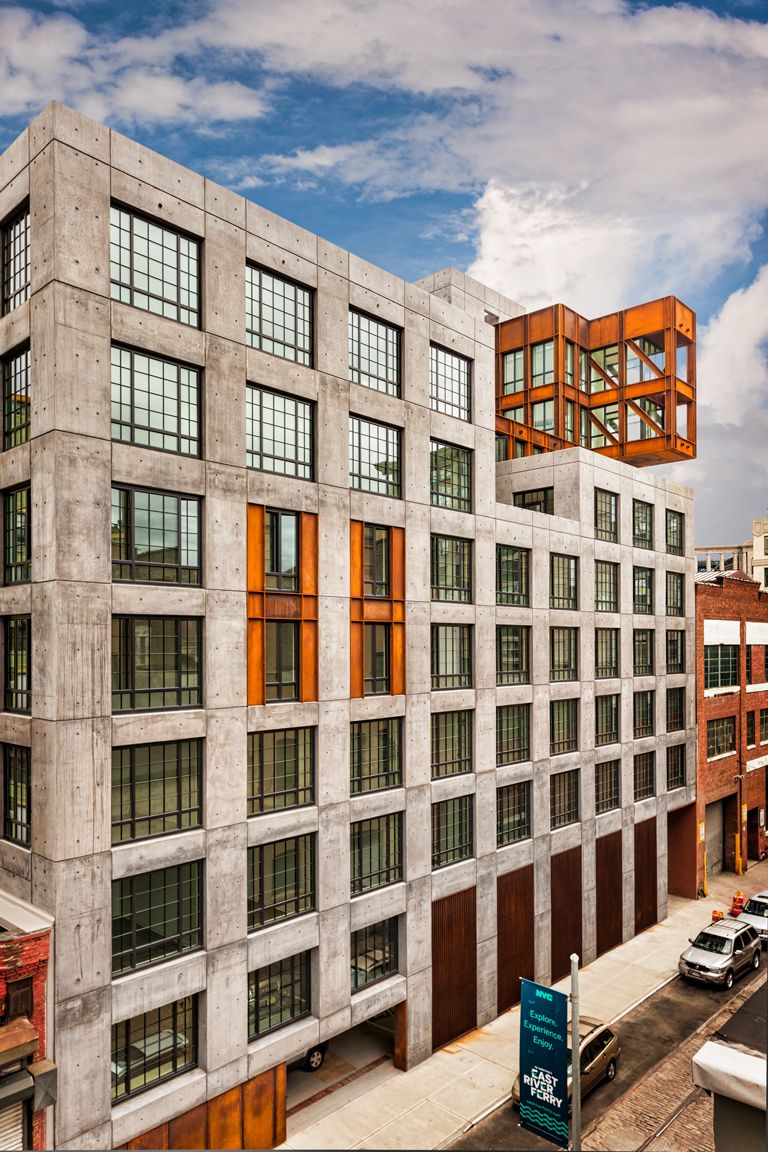
205 Water Street to me fits perfectly into DUMBO on both of its streets. It is a beautiful object that fits seamlessly into its context, not an object that screams like an object, like you can see with some other buildings.
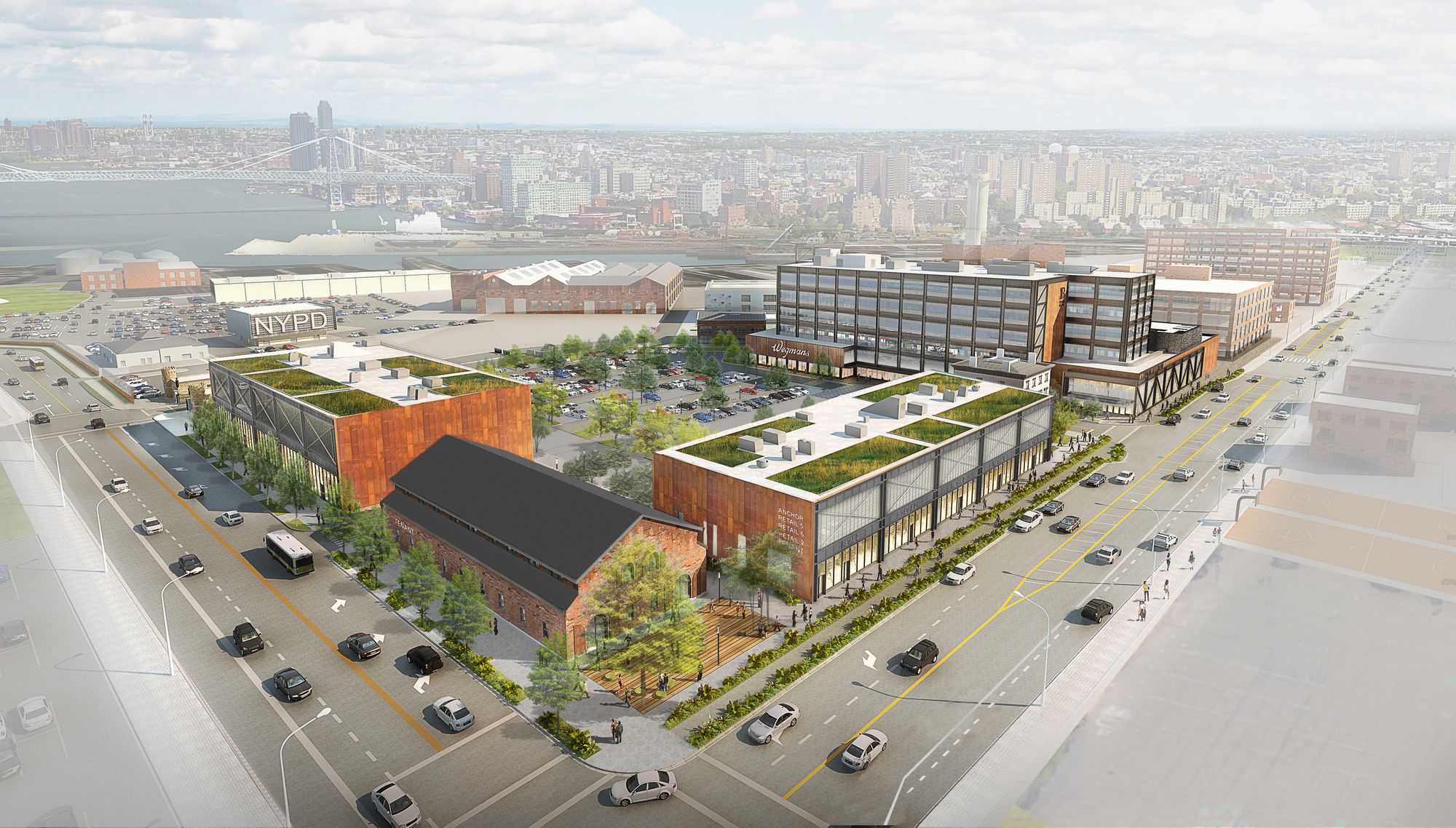
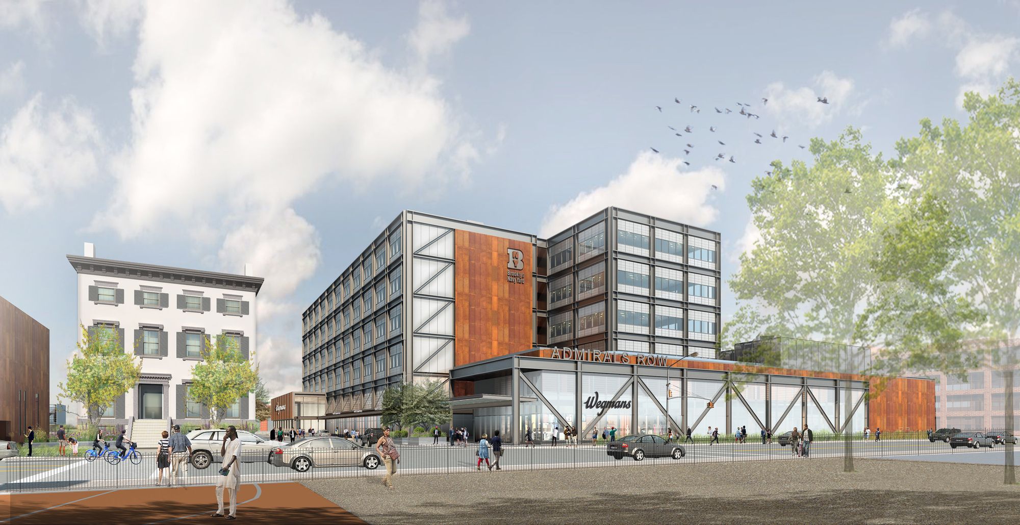
Admirals Row is the first part of the opening of Brooklyn Navy Yard to the public – it becomes a front door for the surrounding community.
Industry City, even though it is a city unto itself, we are creating a neighborhood there, opening it on all four sides so there’s porosity that comes in and the west side of 3rd avenue is not just this blank wall that you have to find your way through.
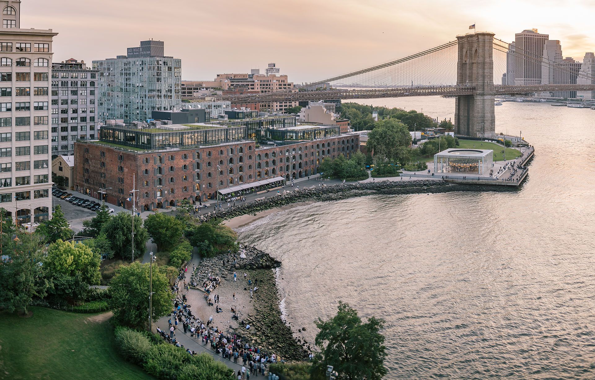
Empire Stores – making that connection to Water street where it used to be a fenced off block. Even 606 Broadway [in Manhattan- ed.] – literally closing an urban tear.
NM: The gritty nature of DUMBO I feel has a lot to do with the fact that, as you walk down the streets, the sides and backs of the buildings become part of your experience of the street. You don’t have these perfect street walls, and because of that, you get these fragmented views of facades and what have you.
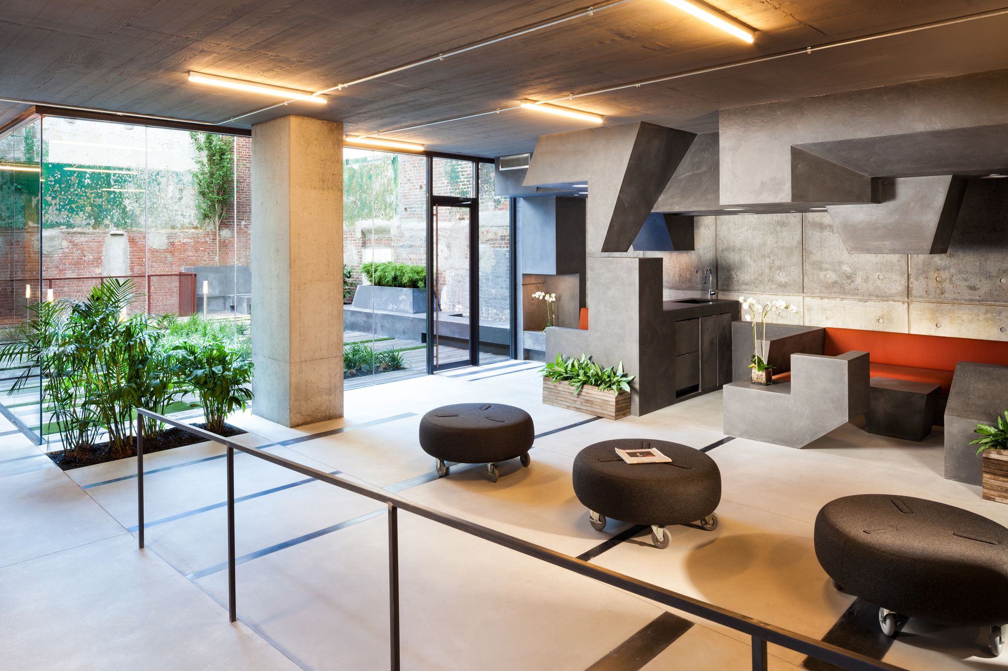
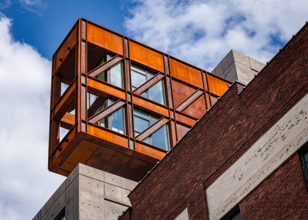
I do like how we reflected that at 205 Water – we started undulating, moving the facade and massing up and down and then creating this little cantilever which was a response to the bridge. They [developers] wanted to finish the courtyard and we said – leave it raw, because then when you suddenly come to it you feel like you found and archeological artifact. I do like 205 Water because of how it fits into the context.
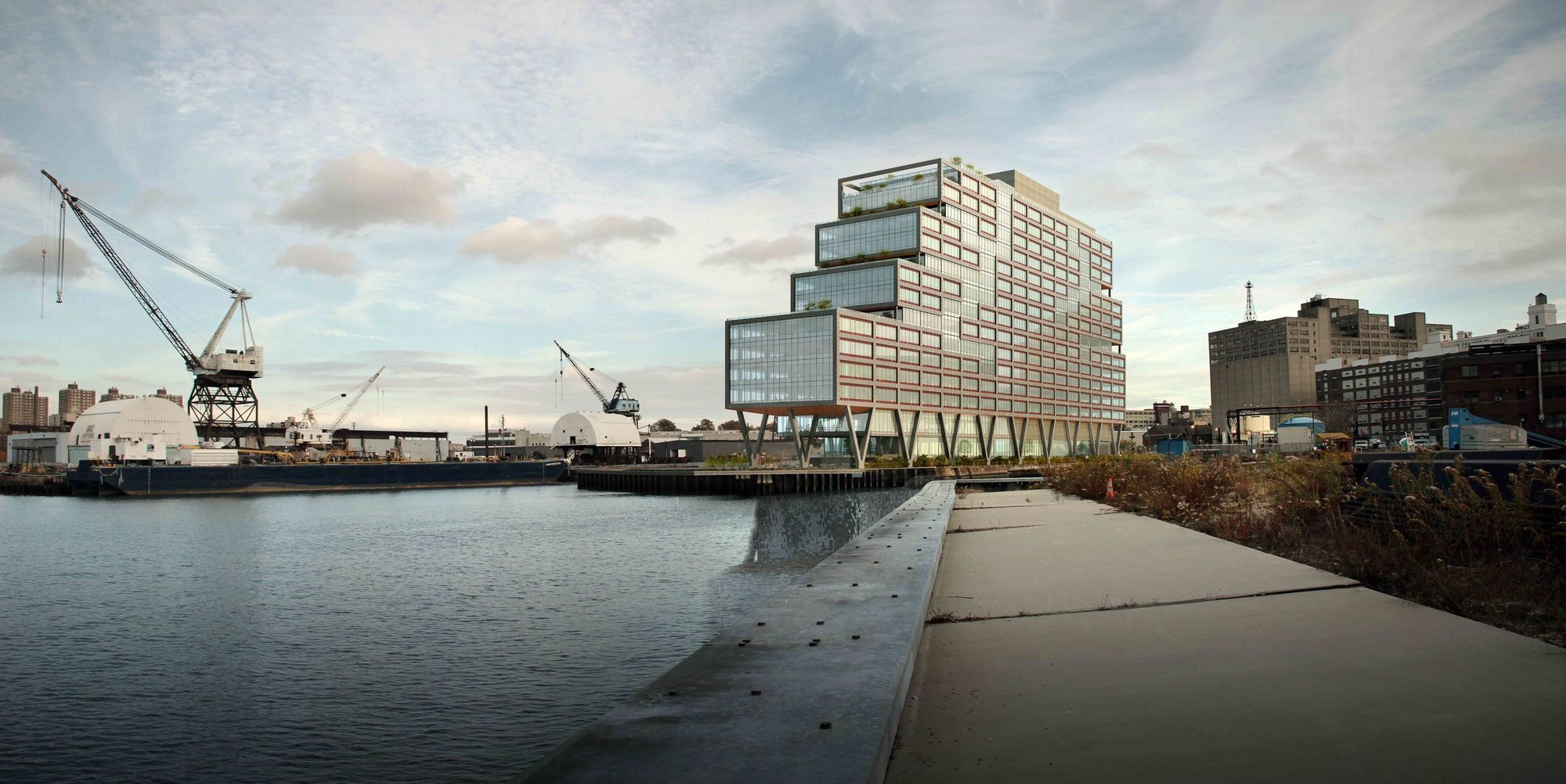
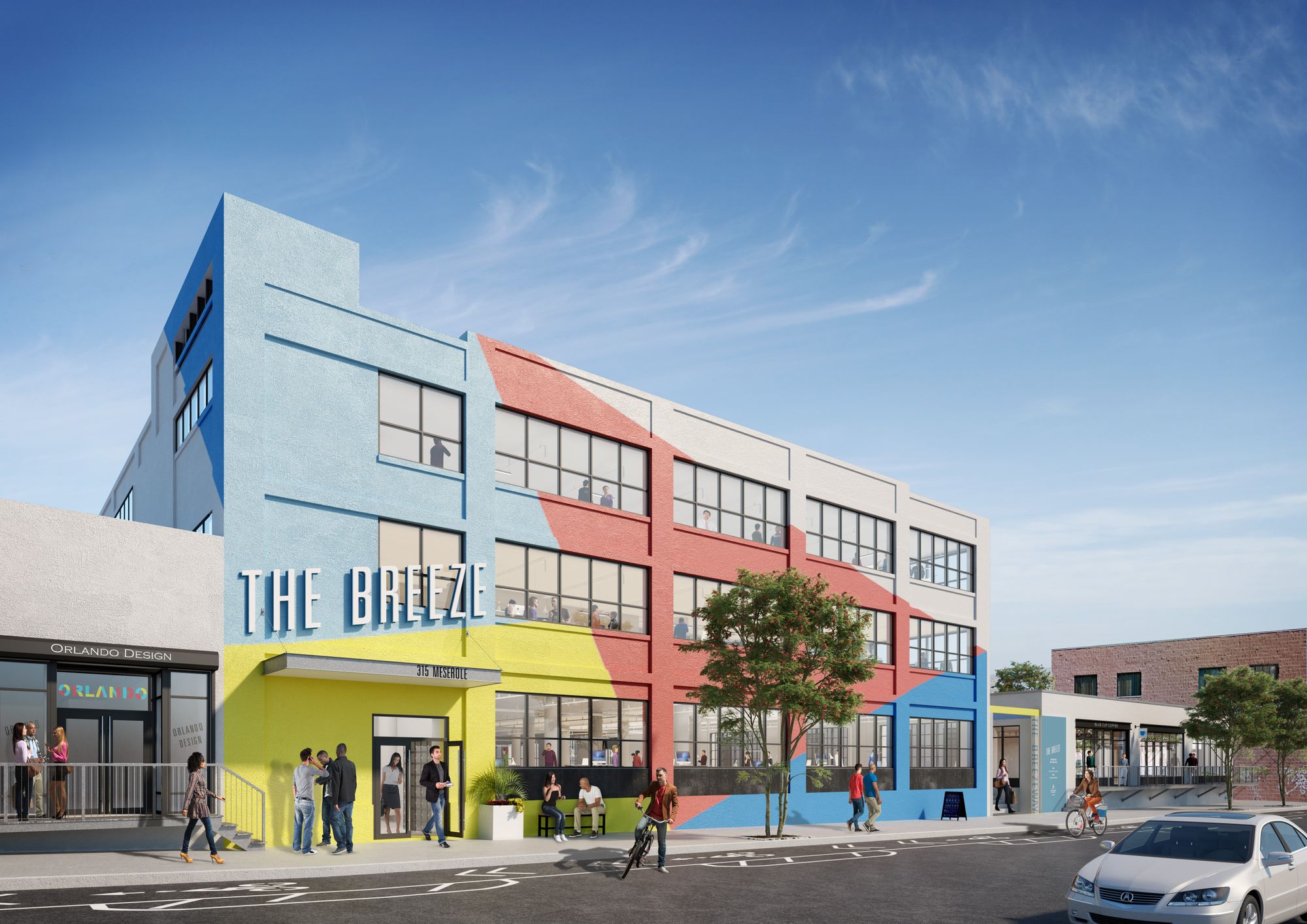
Dock 72 – Dry dock, long building, flood plain – we had to lift it because of the flood plain, and then we carved it to capitalize on the views. WeWork is all about these communal spaces and then connecting them to each other and to the outside space. We’ve been thinking about work a lot.
LZ: Any favorites?
JC: I do like how the architectural transformation is changing Industry City – taking beautiful buildings, that are sitting almost vacant and creating workplaces – not high end offices, or shopping opportunities, or really expensive apartments – places for people to work. Which I think is really cool. When it was Bush Terminal there were 20,000 people working there and we are looking to have more than 15,000 again.
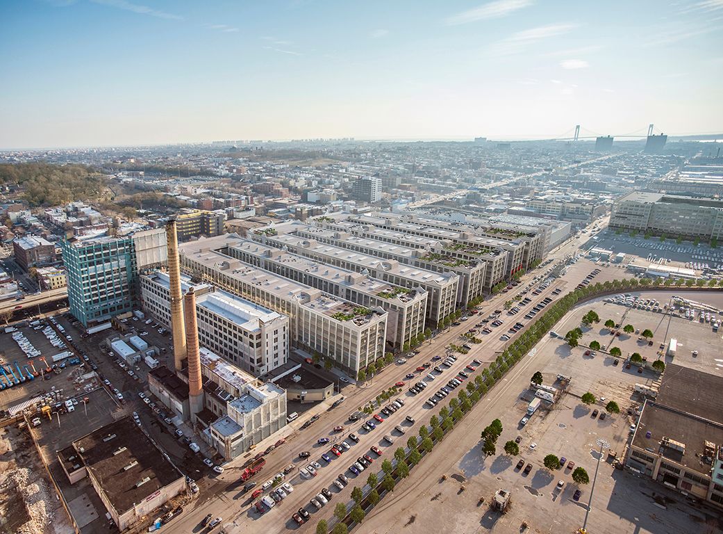
The goal is to make space for 21st century innovation economy. A lot of the new wave of makers industry started in places like Brooklyn Navy Yard, and there is no good place for them to work. They all benefit from collaborating, the spaces are not that specific. They generally don’t need large assembly lines or big tanks for seltzer, but they all want to be in a 24/7 environment because people work all sorts of hours these days.
You think about designing that kind of flexibility, and you think about how to make people feel safe leaving work at midnight or whenever they leave, or arrive. We are working to make it so that it feels more like a city at street level and then upper floors can be more flexible. But on the ground floor – really showcasing some of the industry and what is made at Industry City.
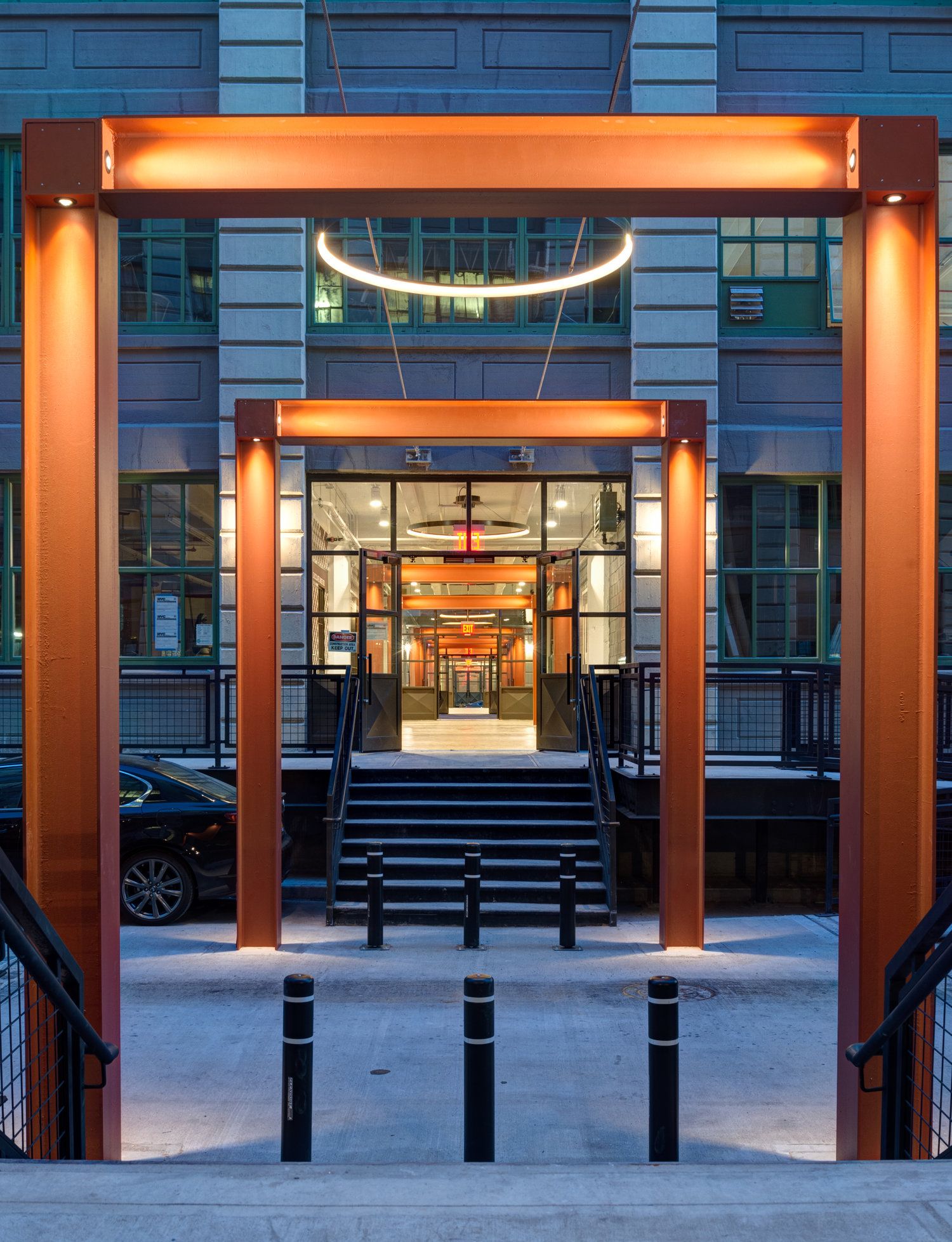
Our big move with the master plan was to cut what we call the “finger buildings” through Innovation Alley. We then built raised sidewalks and loading platforms to organize the streets – it was an amazing success – unlike before, now everyone knows where they are.
What people don’t realize because everyone concentrates on the finger buildings, that large amount of the bulk is on 39th street as it goes to the water – 800,000 square feet are still sitting completely empty, so there will be a lot of growth still to come.
LZ: Neptune/Six in Coney Island is very different.
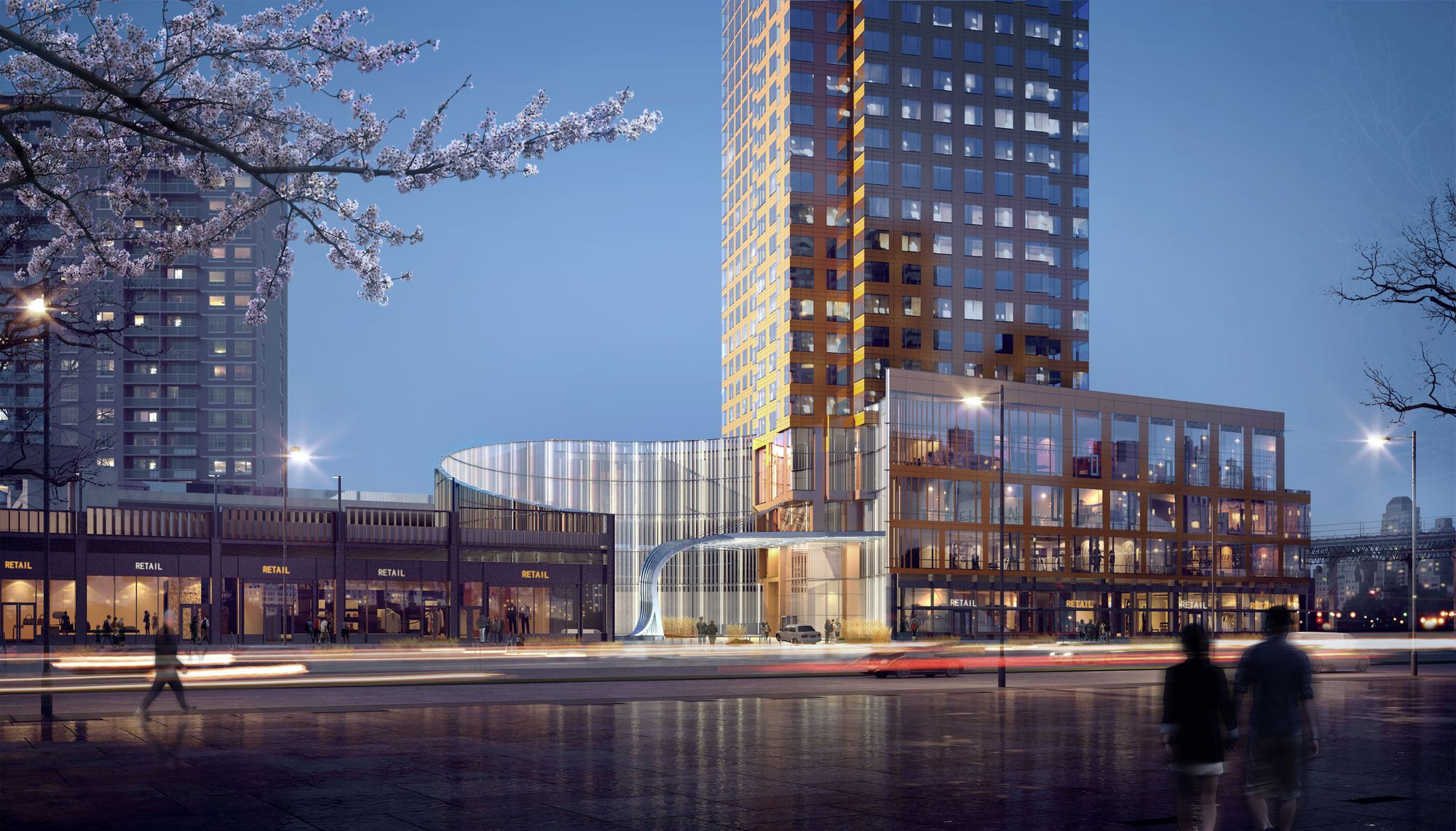
NM: This part of Coney Island is not a contextual place. This really is part of the city where there are objects [towers, ed.] in space. The blocks are ugly shaped, they are not small blocks, its not your typical Brooklyn street or streetscape.
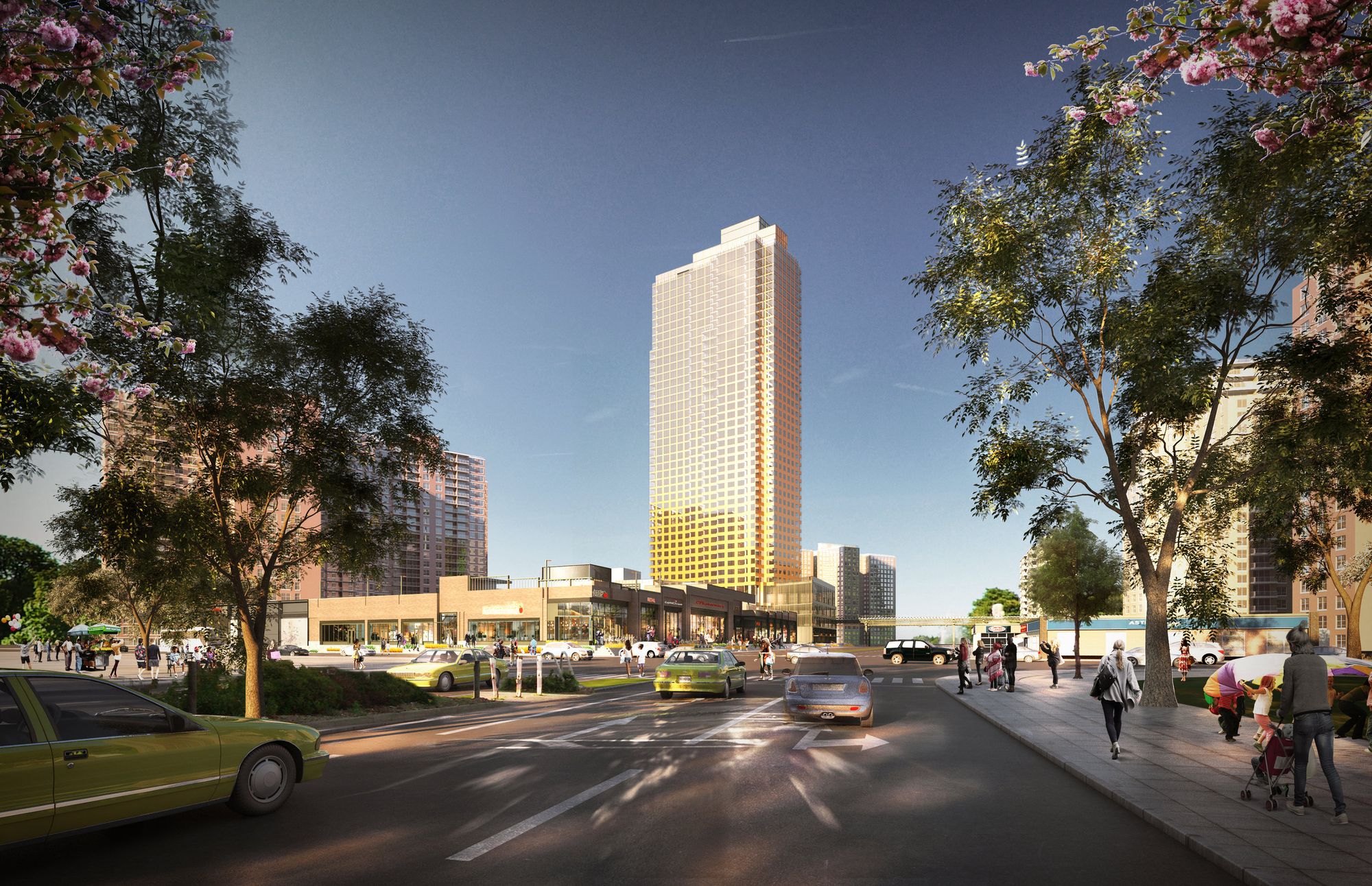
To our client, the views were most important. People are building all these objects because of the views. We also oriented and shaped the building to capitalize on those views, but we also realize that it is still a giant block, and it doesn’t really have “across the street” – across the street is just parking.
To create that residential feel you are thinking about the relationship between the two buildings – the office building on one side of the elevated subway station, and the residential building on the other, and try to do improvements with the bridge.
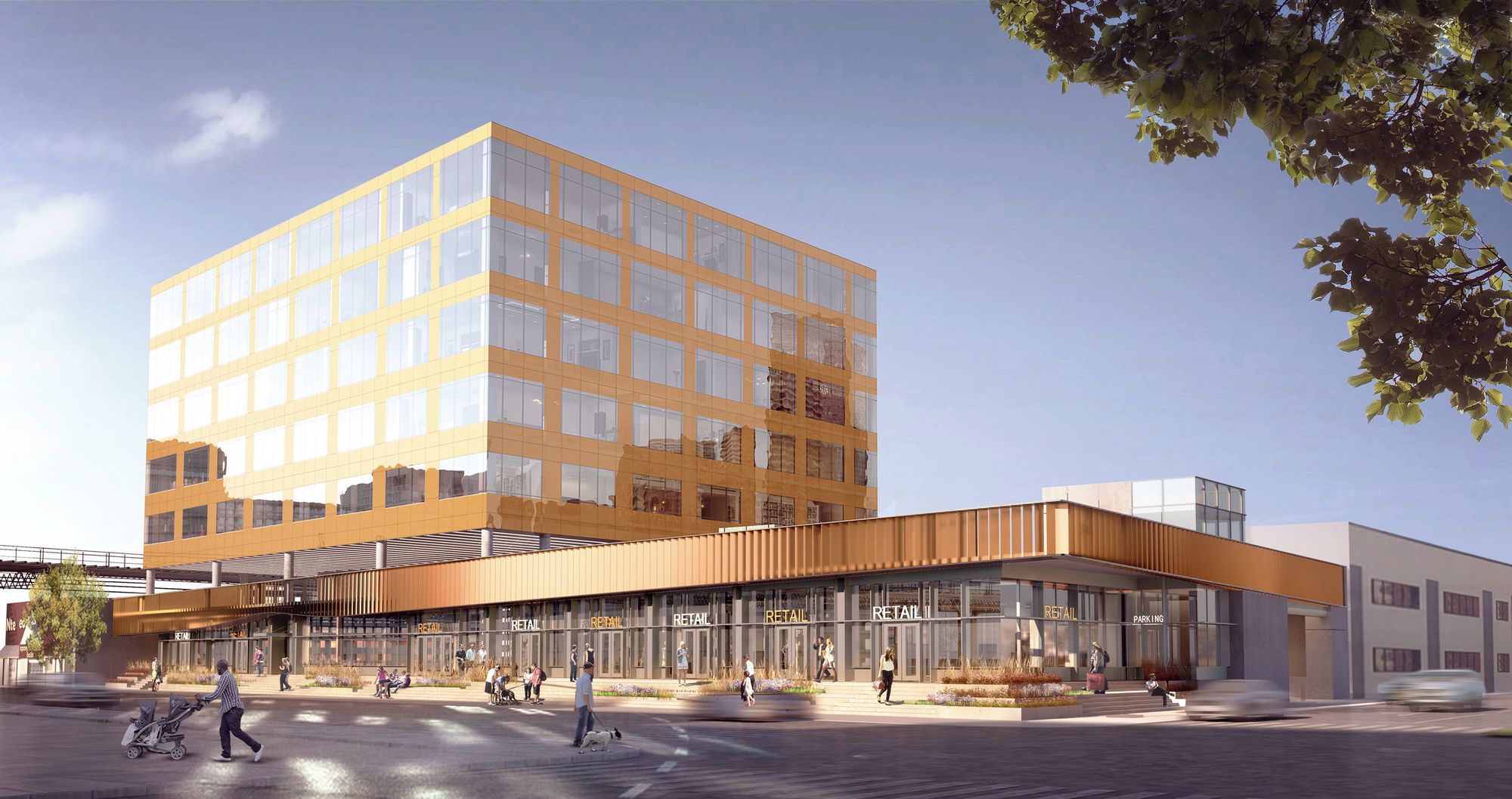
It used to be just a strip center, and the area feels very suburban, except for the towers, because there are no street walls right now. Once all parcels are developed it could feel very different. We put all parking behind buildings. This allowed buildings to come to the street, have storefronts and create that street wall. Our hope is, that at some point when the lots across the street are developed, they would do something similar. Then you start having a street with shops on both sides.
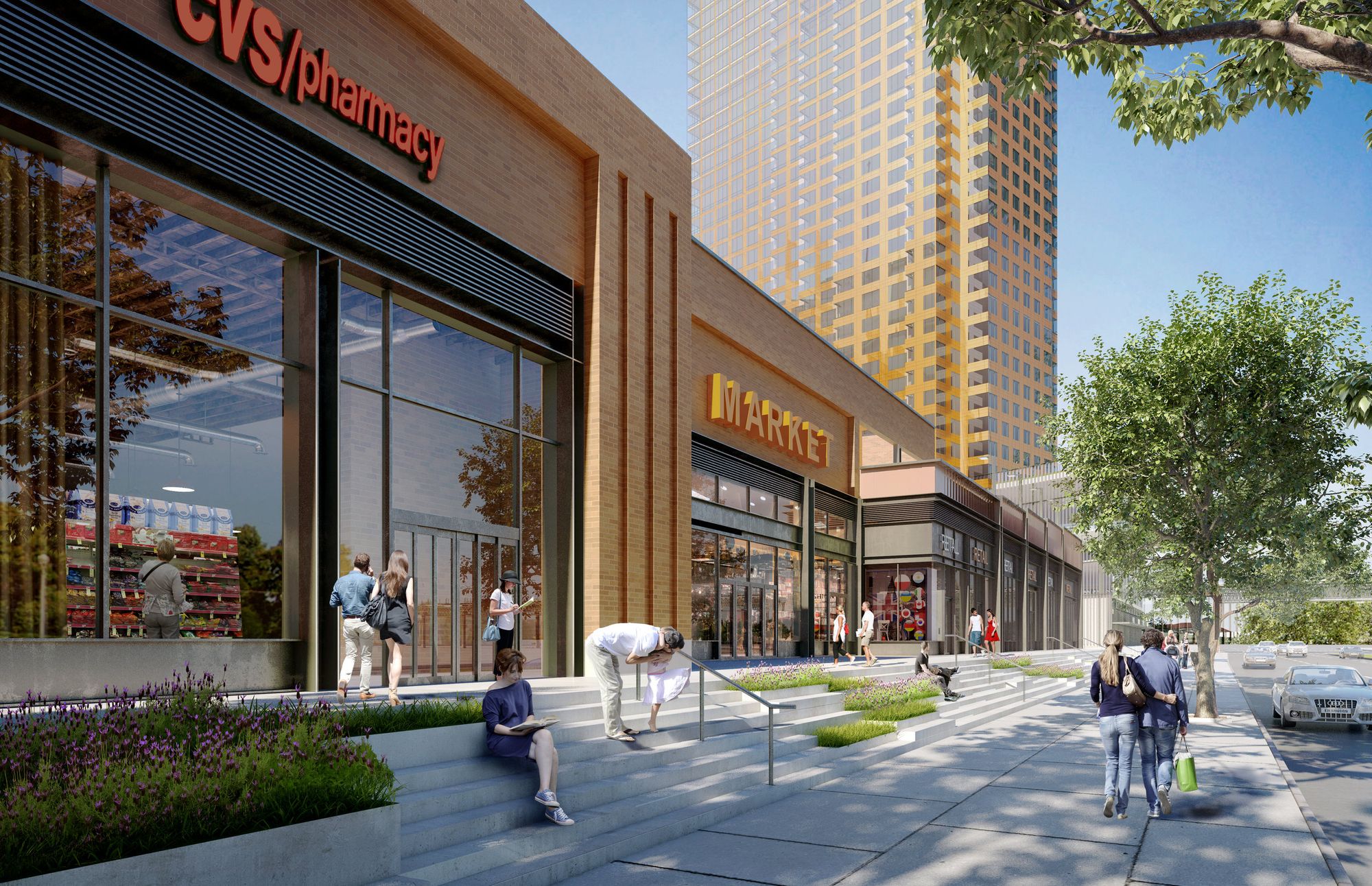
JC: The public sidewalk on the right hand side, private sidewalk up above is a design solution, as the buildings had to be raised above the flood plains. A lot of buildings in Brooklyn and Queens will have to be built this way. Like SoHo, basically, or Industry City. Buildings used to be raised for trucks to have easy access, now it is the flood plains.
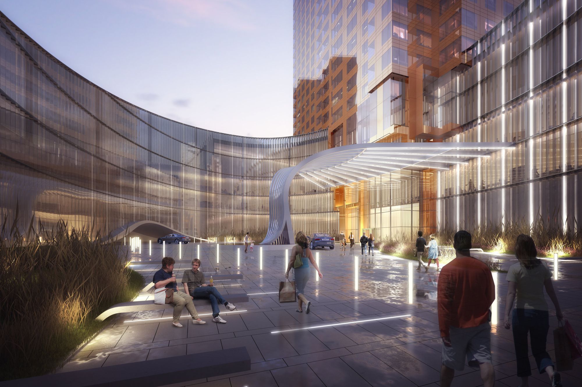
JC: There was no context here. There certainly is a neighborhood, there are people living here, and the former Trump Village but there wasn’t a “there” there, so we tried to create a streetscape, a neighborhood main street not just for our project, but for the people that live around there. It will have all the services – grocery store, restaurants, drugstore, bank, places that everybody goes. We were careful to try to animate the ground floor with smaller retail units so that there would be that finer grain fabric. That was important to us.
There has been some concern about homogenization of urban retail space.
JC: I think that [designing for retail] is one of the things that a lot of architects fail at – even though they do a beautiful building – whether it is contextual or an object. They extend that building down to the street and just say “ok, the stores are gonna go here” – and you end up with 200 feet of the same curtain wall glass, or the same treatment, and the piers are too deep, so the stores are always in shadow …
If you look at successful shopping streets in urban neighborhoods, there’s a kind of chaos but there is a fine grain to it where you have space for street furniture, like when a little shop puts the bench outside and the planter – it humanizes it automatically. How do you provide for that? Blade signs, if done right, are a great tool to also humanize the street, the 200 feet get broken up and it starts to feel like a collection of little things. And articulating the storefronts.
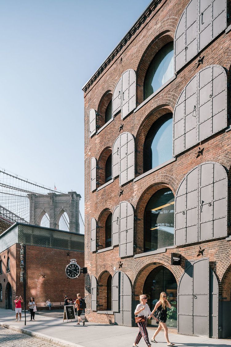
You can’t always have everybody different, because that’s a little too chaotic. It is tough. And retail is constantly changing – people want to combine or split up storefronts, each tenant is different – an Apple store will not want what Foragers Organic foods wants.
Depending on a type of building we try to provide a “kit of parts” for that and a design criteria manual that all the tenants have to adhere to, and also so the landlord understands what they can do. We spend a lot of time on that and try to educate our developers as well. It’s tough in an urban environment, but that’s where I think buildings often fail – like- they just gave up.
You don’t want the large blocks to look like a shopping mall, you want them to look like a street, and be able to iterate like a street does – that’s why we like to do a kit of parts and and you have to adjust your storefront so it does not always have to relate to your structure. They used to do that really well a hundred years ago with cornices separating upper and lower floors – it still works.
How do you build a lot, while preserving the surrounding communities and human scale?
NM: We are doing a lot of affordable housing. The city is pushing to build a lot of housing and it has to be inexpensive. But you can still be creative within that, I don’t think you should give up, I think it is possible to do good, affordable buildings. We are doing Bronx Point, which has a Hip Hop museum to it, and that’s ambitious for a housing project.
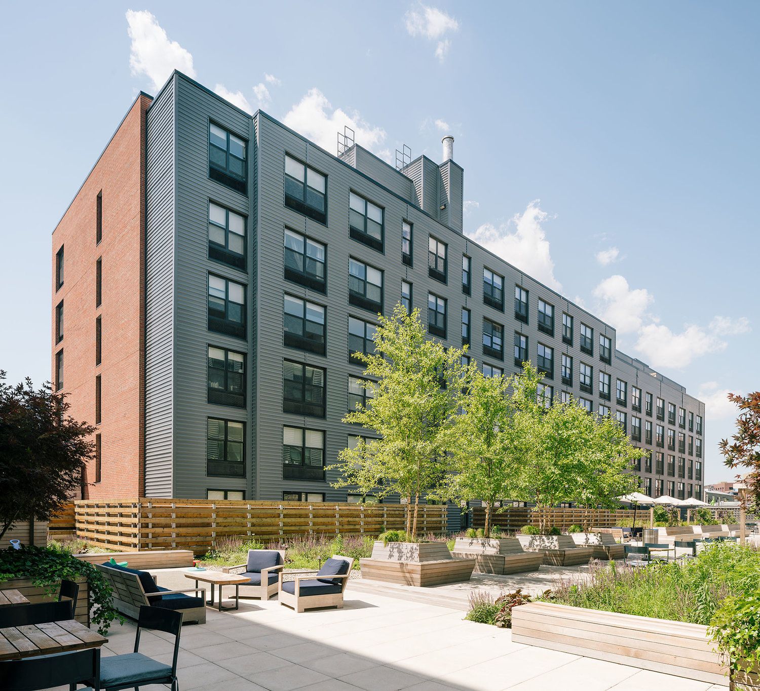
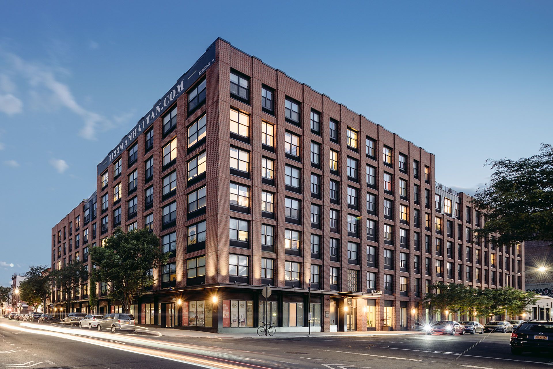
There will be some changes, with the City’s shift towards smaller units. HPD [Housing Preservation Department] has revised their requirements – they used to require much larger units. At some of our mixed income projects – like 1133 Manhattan Ave – the affordable units were almost bigger than the market rate units, but now that’s changed.
People don’t like change. The “needle buildings” – they are not as impactful as big walls. 80 Flatbush will be a marker. If it’s done well, it will be fine. Even the ones around the Central Park that everyone’s objecting to – I don’t think they are going to have as much of a negative impact as people think, whether they are the right thing to do or not. I am not as upset about single, isolated objects, much more when I see a whole development somewhere that looks totally alien and not part of the city.
Trends?
JC: We are almost out of the 70s. You look at furniture, you look at fashion, we’ll see what comes back.
Thoughts on the architecture that’s coming into Brooklyn and changing it?
NM: For me it is not just about Brooklyn, but I am concerned. I love a lot of the buildings that people are designing as objects, but I am concerned that some of these buildings, as beautiful as they are, they don’t really relate to their context in any way.
To me what was always amazing about New York were the streetscapes. You would walk by the Chrysler building, which is very iconic, and you would never even know that that tower is above you. Because on the street it was all about the public realm – about the street, and the shape, and its geometry and imperfection.
And I think we have lost some of that. Every building is trying to outdo the other one, trying to be an object. It’s difficult. It’s difficult because there is pressure both on developers and architects to out do the previous one and create yet another beautiful object. But city’s not just about objects – the buildings are the glue that tie the fabric of the city together, and if they become objects there is nothing that ties them together – it falls apart.
That’s what I’m worried about – the buildings not working collaboratively together to make it bigger. The whole should be bigger than any individual piece and I sometimes feel that’s not happening. Sometimes it is, but many times I look around and I could be in Singapore.
JC: It’s not like we have to stay super historical, but it used to be if I dropped you in Boston, you’d know you were in Boston. If I dropped you in Chicago, you knew you were in Chicago. Same for New York and San Francisco. They all had a modern kind of feel, even though they had varied architectural styles. Something that was specific to each place.
NM: – New York has gone through many transformations, but it was always unique and always New York. Now in certain areas – you look at some of the new developments and you could be anywhere. It’s becoming almost like retail malls – everywhere you go you have the same shops – except with buildings. Which is a little sad.
Solution to that is?
NM: I’m not suggesting we mimic history. In my mind your starting point should be where you are, and even if you want to do something that is totally contrasting with what’s around it, at least you understand and realize what’s there first. Solution is, with each project to really try to understand the context, to understand what the place is about, what makes that place unique. And then find a way to weave that into architecture. If people did that, places would become more successful. They would have more identity.
JC: – Everyone talks about doing something authentic – but when you contrive to do something authentic you are automatically not authentic. But if you are being thoughtful about why this building only works here, why it does not work on that corner over there because the history or because of the way the grid is, or because of what’s around it, then it is going to be authentic because it is unique. You can’t just design an object and say put it here.

