Seeing Red – How Much Has Brooklyn Changed Since This Map Was Published?


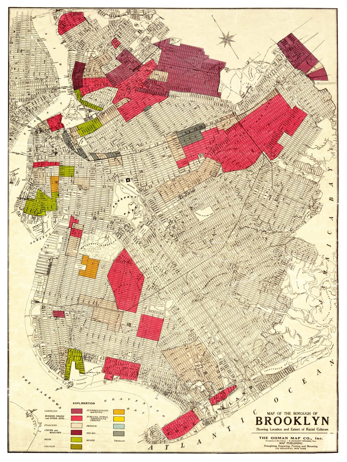
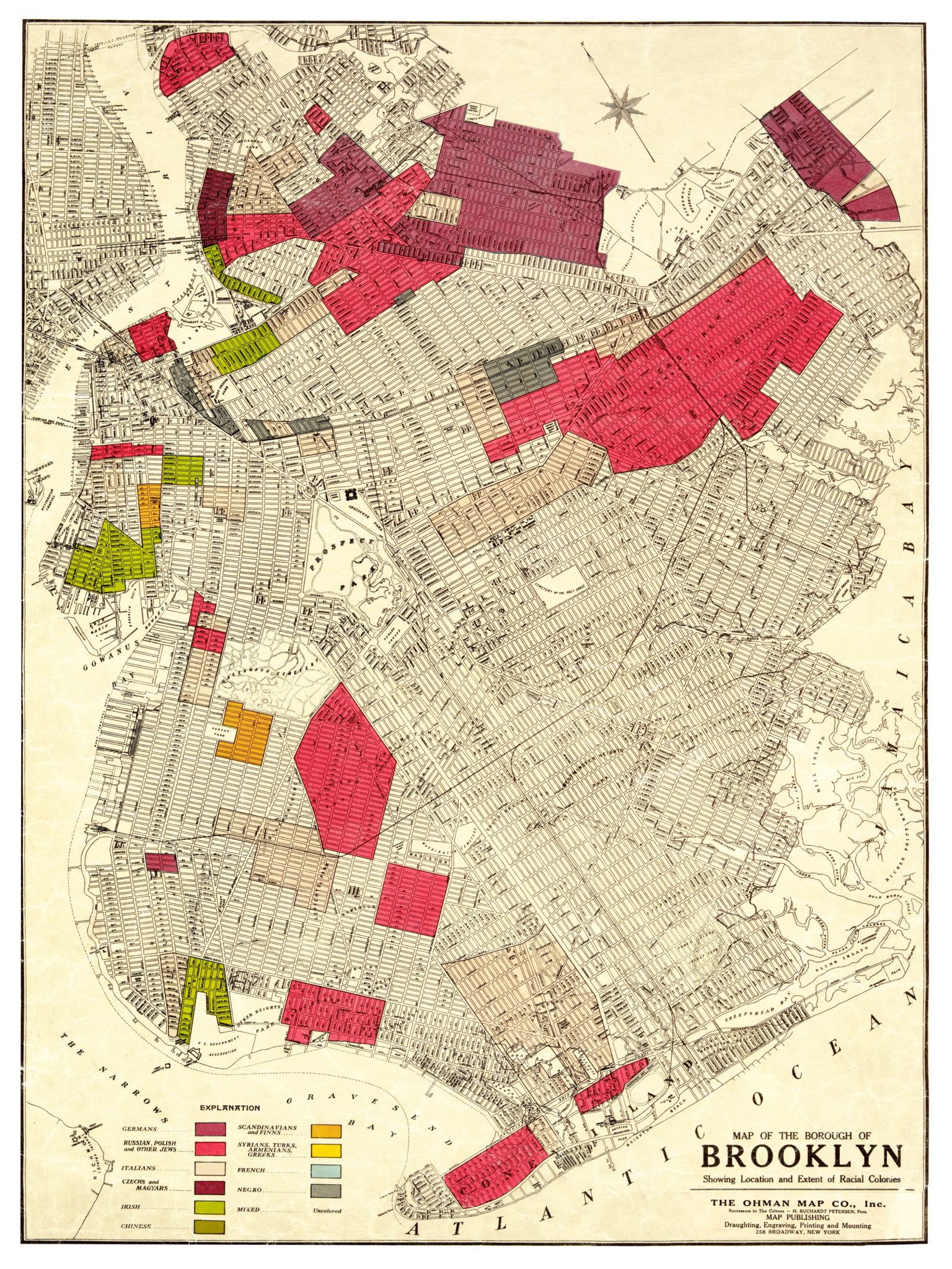
You’ve probably seen this map. It was published in 1920 by the Ohman Map Company “Showing Location and Extent of Racial Colonies” in the borough of Brooklyn. It is also a popular exhibit at the Brooklyn Historical Society (BHS).
Reasons for its production, however, were rather sinister: this (and a similar map for Manhattan) are commercial versions of maps produced the year before for the NY State Joint Legislative Committee to Investigate Seditious Activities, also known as the Lusk Committee, which put out this report.
Why?
Following the Bolshevik Revolution in Russia and growth in the leftist movements across the world, the United States was in the grip of a Red Scare in 1919:
“The Great War has shaken the foundation of European civilization. The same forces which promote civil strife in many of the countries of Europe are at work on this side of the ocean seeking to create a division in our population, stimulating class hatred and a contempt for government, which, if continued, must necessarily result in serious consequences to the peace and prosperity of this country. In doing this they are taking advantage of the real grievances and natural demands of the working classes for a larger share in the management and use of the common wealth,” report states.
According to the BHS “In addition to showing ethnic enclaves by color, the 1919 maps were indexed and numbered to show locations of suspected radical group meetings and publishers. The Manhattan map lists 63 meeting halls and 44 newspapers, while the Brooklyn map lists 23 such halls.”
Areas colored red were used to color areas where recent Russian, Polish and Jewish immigrants resided, suggesting their perceived political leanings as well.
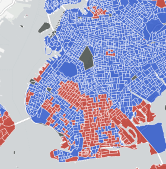
These days much has changed politically. DNA Info created this map following the last Presidential election, except the color red now associates with conservative ideology:


