New Subway Designs Proposed To Match New Yorkers’ Seating Habits

What is your subway strategy? For me, when the train is empty, I head for the edge of a seating platform, preferring to have a barrier of bars to my left or right. When it’s half-full and I have a long ride in front of me, I might try to squeeze in an empty middle spot, unless the people to my left or right are especially smelly or slightly insane or incredibly obese. When the train is crowded, I shoot for some space by a door, preferably on the side that opens less as the train gets more jammed.
These are the silent thoughts that go through practically every subway riders’ mind when they gear up for their commutes, all with the same goal of making the annoying experience as painless and as comfortable as possible. Well, the MTA has been studying your subway exit strategies and seating habits all with the purpose of designing new subway cars that match your behavior and make for better riding experiences for everybody, according to a report by the New York Times.
The study yielded some interesting observation and statistics:
When a subway car has more passengers than seats, the study found that an average of 10 percent or more of the seats were not taken. And even when a subway car is less than half-filled, the authors found that a small percentage of riders would inevitably choose to stand.
Riders prefer seats near a door, the authors said, and demonstrate “disdain for bench spots between two other seats.” Those who stand also prefer to do so near doors, in part because of its many “partitions to lean against,” and for the precious seconds they save getting off the train.
But the doorway area was desirable for a less obvious reason, too, the report found; it allowed riders to avoid “the sometimes uncomfortable feeling of accidentally making eye contact with seated passengers.”
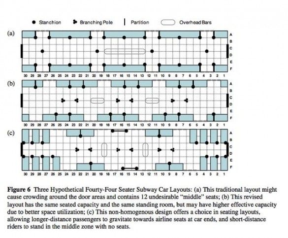
With these observed behaviors in mind, the MTA began to graph some potential new designs that might ease congestion, benefit long-term riders and satisfy people looking to make quicker exits. In the image above, the MTA focused in on “choice-c,” which practically eliminates seating in the middle and provides airline style seats for long term riders near the back. Seems kind of interesting. I also notice that the off-centered seating of the benches near the middle might help people avoid awkwardly staring into each other’s eyes over a long commute.
We were wondering what our readers think. Do the new designs make sense? Do you think that all of this behavioral tinkering makes sense? Let us know.


