New Graph Shows Income Inequality Along The Subway Routes

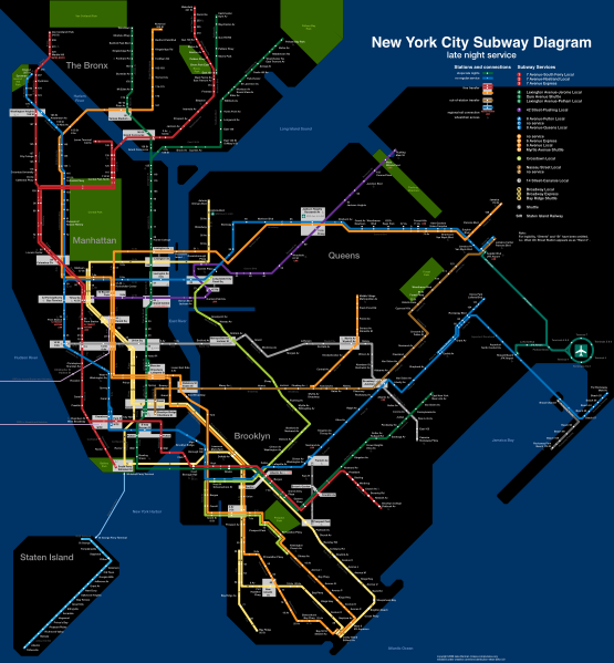
If you live on the far end of a New York City borough and have the distinct pleasure of sitting through a 45-50 minute commute into Manhattan every day, you gain a unique experience. The trip highlights the diversity of races, cultures and economic classes as the train rumbles from your more modest home towards Fancytown. While it’s easy to notice the types of people you see on the train – homeless, hipsters, lawyers, mothers and tourists – it’s harder to guess their socioeconomic status, even if you have a rough idea. Thanks to the New Yorker, you can now know exactly how much people are making through their handy interactive graph which charts the median household incomes via subway stops.
The results will probably depress you, especially if you are a normal schmo from Bensonhurst, Sheepshead Bay, Brighton Beach or practically anywhere outside of the confines of Manhattan. The luckiest New Yorkers live off the 2 and 3 lines by Park Place and Chambers Street. If those people are even using the subway, they are on average earning more than $200,000 a year.
Riders near the 18th Avenue D stop in Bensonhurst clock an average of $39,524. Borough Park riders near 55th street also earn about $39,000. Further south by the Sheepshead Bay Q station, riders earn an average of $33,616. Brighton Beach riders are even less affluent, with the median being set at $28,398. If Q train riders from Southern Brooklyn want to see some fancy people living off their line, all they have to do is drop $2.50 and ride up to 5th Avenue in Manhattan where the median household income is set at a breezy $171,000.
It’s a fascinating graph filled with huge spikes that tower over the lowly millions in far more precarious economic situations. Sigh…


