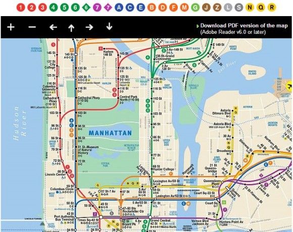
MTA Joins 21st Century With “Interactive Subway Map”… Unfortunately, It Still Sucks

The MTA sent out a press release earlier this morning, boasting of an “interactive subway map for easier viewing of fine-grain details.”
Using the new map, “you can zoom in to enlarge any part of the map and expose details for easy viewing. Just scroll your mouse’s rollerball or click on the map’s zoom button. You can also click-and-hold your mouse button to drag the map with your mouse or click on pan buttons to change the section that’s visible.”
Gee whiz! I can just scroll my mouse’s rollerball and click on things? Golly, the future sure is groovy!
Unfortunately, the map still sucks.
Billed as a replacement for their infuriating previous option, a downloadable .pdf map that needed to be opened in another program, the latest feature isn’t really all that different. Sure, there’s no download required, but it’s essentially just dropped the .pdf map into an embedded .pdf viewer without adding any real interactivity or usability.
Embedded .pdf viewers like Scribd have been widely available to any schmuck with a keyboard for at least six years now.
And, of course, it’s no real improvement for users. We may get to skip the download, but for those looking to plot a trip through the city using unfamiliar routes, the MTA’s subway map is near useless without showing the entire street grid. There are no “fine-grain details” to zoom into with my “rollerball.”
For years now, most savvy users have turned to Google Maps or the alternatives to plan trips, especially since it has another great feature (beyond directions) that the MTA should adopt – maps that consider the entire transit environment, showing subway, bus and rail lines.
Unfortunately, Google Maps isn’t always on target when it comes to the MTA’s constant service disruptions, so planning a trip without referring back to the MTA’s website is still perilous.
So why am I writing about this? Because the MTA’s announcement is just galling. Don’t put out a press release touting “major improvements” that wouldn’t have been impressive even 10 years ago. Through rider fares and taxpayer subsidies, we put a lot of money into the system. Is it too much to ask to put a little bit of that money back into developing a map that will actually help riders in the 21st Century?


