MTA’s 2011 Customer Service Satisfaction Survey

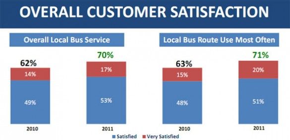
THE COMMUTE: The MTA just released the results of another Customer Satisfaction Survey approximately one year after its 2010 survey I reported on.
According to the survey, the vast majority of customers are satisfied with the service they receive, at least for local buses. Does that sound right to you?Just as last time, separate reports were issued for subways, local buses, and the railroads, all found under Board Materials on the Transparency Tab of the MTA website. There is no report for express buses.
There is a good rundown of the subway survey, along with a discussion of the faulty methodology the MTA employed, in the article and comments at Second Avenue Sagas. Therefore, I will limit my analysis and remarks only to the bus survey.
Before I start sounding too negative, let me preface my remarks by stating that New York City is very fortunate to have a very extensive bus system that does a fairly good job about half the time. If you are lucky to live near and use one of the bus lines with frequent service, chances are you will be satisfied and that is pretty much what the survey found. Even if buses do bunch, there is enough service on those routes so you still will not have to wait too long for the next one limiting your level of dissatisfaction.
However, if you require a route that has moderate levels of service, i.e. every 10 or 12 minutes, you will be less satisfied. If your bus route has 20- or 30-minute headways, chances are you will not be satisfied at all. That is what we would expect to find, but the survey results do not show this and here is why.
The sample size is too small for the responses directly related to service levels to be representative of all riders, and there is no breakdown by time period; the numerical scale respondents used for their responses was confusing so respondents may not have said what they actually meant; and more service related questions were needed. The MTA wants you to believe that the sample is accurate and goes into a discussion of how the results were weighted using census and demographic data. This is all good, but that does not mean that the survey proportionately solicited enough opinions from bus riders using routes with sparse levels of service. I will explain a little later.
Missing Questions
Ask any bus rider what the biggest problem is with the buses and the most frequent response by far will be that they bunch far too often. Yet, the MTA did not ask riders how serious of a problem they perceive bunching to be. The only questions asked were “How satisfied were you with X?” If you want to determine if routing modifications are needed, you ask: “Could any bus routes benefit from a route change?” By merely asking if someone is satisfied with the current routes, you really are asking if they think most of the routes are not deficient. Someone like myself who believes up to 20 of the 55 Brooklyn bus routes need some sort of modification, would still have to rate the bus routing question a 6, meaning that I am satisfied more than half the time.
Most of the questions relate to issues in which the MTA does a fairly good job, like keeping the electronic signs working, keeping the buses clean, maintaining them so you do not have to get off because the bus breaks down, et cetera. The MTA knows this, so those types of questions account for a preponderance of the survey in order to show high satisfaction levels across the board. Of course, those are important issues. But if you ask riders for areas where the MTA needs improvement, those are not the types of concerns you will hear. Shouldn’t the purpose of a satisfaction survey be to learn how you can improve, not to tap yourself on the back for doing a fairly good job in order to use the results to improve public relations and to provide an excuse not to address real problems?
Sample Size
The sample size, though small, is adequate for non-service related questions. Satisfaction regarding fareboxes, or bus temperature for example, will not vary from route to route. The survey size, however, for questions directly related to service levels is far too small to be fairly representative of riders from all bus routes, even with the weighting factors used.
Opinions about service will vary greatly from route to route, between boroughs, and by time period (rush hour vs. non-rush hour, weekday vs. weekend, day vs. night, and by season). You will get the most favorable results in the spring and fall when the weather is not extreme and when people are the most satisfied, which is when the MTA performed its survey.
There were 887 bus riders surveyed. Brooklyn has 55 of the over 300 local bus routes in the city and Brooklyn ridership accounts for about 27 percent of total city bus ridership. It would be safe to assume that about 240 respondents were from Brooklyn. That averages out to about four respondents per bus route.
The problem is that the six most heavily traveled routes that account for about 72 of those respondents will most likely have a higher opinion regarding service levels than those riding the other 49 routes, where only about 168 respondents were represented. About 12 people per bus represented the top six most heavily used routes whereas the other routes averaged three respondents per route. Lightly-utilized routes such as the B4 were most likely not represented at all or at most by one or two respondents. Since some respondents may have answered questions about more than one bus route, the numbers may be slightly higher, but the MTA has not made that information available.
So what the MTA is saying with this survey is that it only matters what the average local bus passenger thinks regarding service levels and no attention need be paid to express bus riders or the nearly 40,000 daily weekday local Brooklyn passengers using the ten least patronized routes who were represented by only about 10 to 15 survey respondents. That number would not be high enough to be statistically valid to determine what passengers on lightly utilized routes think about local Brooklyn bus service. Expanding that number to the entire city and the MTA is neglecting the opinions about service levels for about 150,000 local bus riders and about 77,000 express bus riders or 227,000 of its bus customers.
The Scale Used Was Unnecessarily Confusing and Inappropriate
The MTA was seeking to determine if customers are satisfied or dissatisfied with various aspects of service and to what degree. Rather than using words or a three or five point rating system that would have been sufficient, they decided on a ten-point scale, seven categories of which, the MTA does not show results for.
Respondents had to remember during the course of about 20 to 30 minute telephone interview what those numbers actually meant when all that really mattered is if someone rated a question a 5, (dissatisfied), or a 6, (satisfied). This would not have posed a problem in a written survey because you could always go back and reread what the scale represents. On the telephone, anyone who was unsure was forced into making a “satisfied” or “unsatisfied” decision, when it would have made more sense for a “5” and “6” to mean “neither satisfied or dissatisfied” or “unsure.”
That would have reduced the chances that someone who was unsure would pick a rating number without thinking just to advance to the next question. “Unsure” or “I don’t know” is a perfectly good response and should have been one of the choices. However, the satisfaction levels would have been dramatically lowered, not what the MTA wanted to show. Their objective was to show at least 50% satisfaction levels for every question which they made sure to do, by not providing breakdowns by borough or time period, so as to convince us they are doing a good job.
Other Shortcomings
A great deal of information was collected. The questionnaire for this year was not made available as it was for the 2010 survey, and there was no separate Customer Priorities Survey. We do not even know if the survey was conducted in-house or if a consultant was used or if anyone audited or will audit it to ensure the survey was conducted as described. So much for the transparency former Chairman Jay Walder promised. All that was made available are broad summary results and a few other details.
In the 2010 survey, separate data was collected for routes used in rush hours and non-rush hours. However, no rush hour / non-rush hour breakdown was displayed. I suspect that satisfaction levels for non-rush hour service were below 50 percent so the results were omitted last year and no such breakdown was requested this year. Statistics were collected by borough but not shown, nor is whether this year’s questionnaire also asked for the specific routes used. Betcha, less than 50 percent of Staten Island local bus riders are satisfied with their waiting time. If that were highlighted by the survey, the MTA would be under pressure to increase service or else be accused of not listening to its customers.
Since opinions about service will most likely vary by route and time period, should not a service satisfaction survey collect and display at least some of those types of data? Is that not more important than asking if someone is satisfied about the condition of the outside of the bus, a question that was asked in the 2010 survey?
No distinction was made between Select Bus Service, Limited and Local Routes. By lumping all three together as one type of service, a true impression about bus routes with only local service is not obtained, further artificially raising satisfaction levels especially when asking a question relating to speed of the bus.
Also, rather than tell you the percentage of total passengers who were “very satisfied,” which would be the fair way of displaying the data, the MTA only shows that number when compared to satisfied customers only and even showing the data that way it is a very small percentage. They conveniently do not break down dissatisfied customers, into “dissatisfied” and “very dissatisfied” for us to see the levels of dissatisfaction so why do they need five levels of dissatisfaction in the scale if not just to confuse people so they forget the very important difference between a five and a six? However, they make sure to highlight that every category shows some improvement over last year.
The MTA makes a point that satisfaction levels went up although there were two major snowstorms. Where does the MTA ask riders how well they think the MTA handled those events? Riders are asked to respond regarding the routes they used only in the past 30 days, a fact revealed in the 2010 survey. So the snowstorm is immaterial to the results. Yet, instead of objectively analyzing the results, the MTA only displays the breakdowns it wants to and stretches every point to its advantage to show the tremendous job they are doing.
Tomorrow: The survey results directly relating to service and how I interpreted them.
The Commute is a weekly feature highlighting news and information about the city’s mass transit system and transportation infrastructure. It is written by Allan Rosen, a Manhattan Beach resident and former Director of MTA/NYC Transit Bus Planning (1981).


