Do You Live In A Subway Desert?
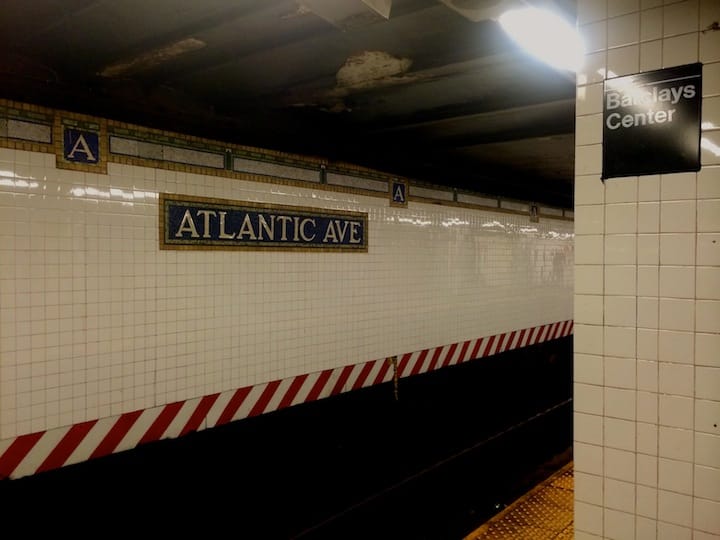

A new interactive map focuses on proximity to subway options and reveals just how parched for mass transit some neighborhoods are.
Chris Whong, a self-described “urbanist, mapmaker & data junkie”, created a map that shows only the parts of New York City which are at least a ten-minute walk from the nearest subway station, and in the process, showed that much of Brooklyn is a significant shlep from the train. The map was created using open data, according to Gothamist.
“People have said 10 minutes is not too far to walk to the subway and 15 minutes is a better threshold for deserts. I encourage everybody to copy my methodology. There’s plenty of room for more analysis, but this was my cutoff point,” said Whong to Gothamist.
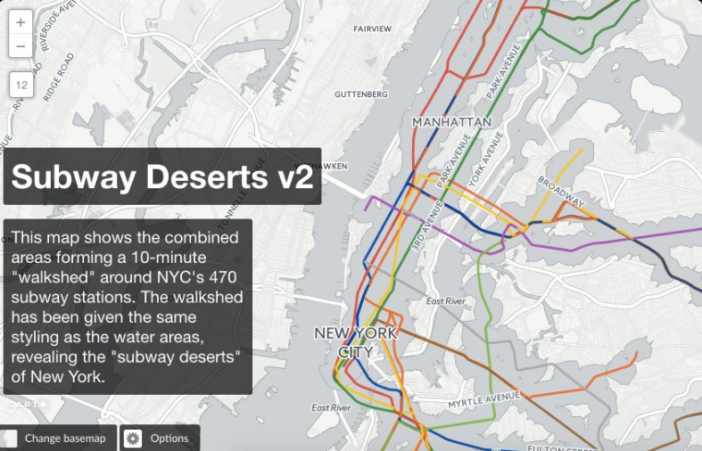
Whong created the first version of the map last year. After some criticism, he’s rolled out a second edition of the map. As Gothamist reports:
Whong took into account criticism that 500 meters or 0.3 miles as the crow flies is not the best measure of walkability, so this time he used OpenTripPlanner data to base the buffer zone on 10 minutes’ walking distance from a given subway stop.
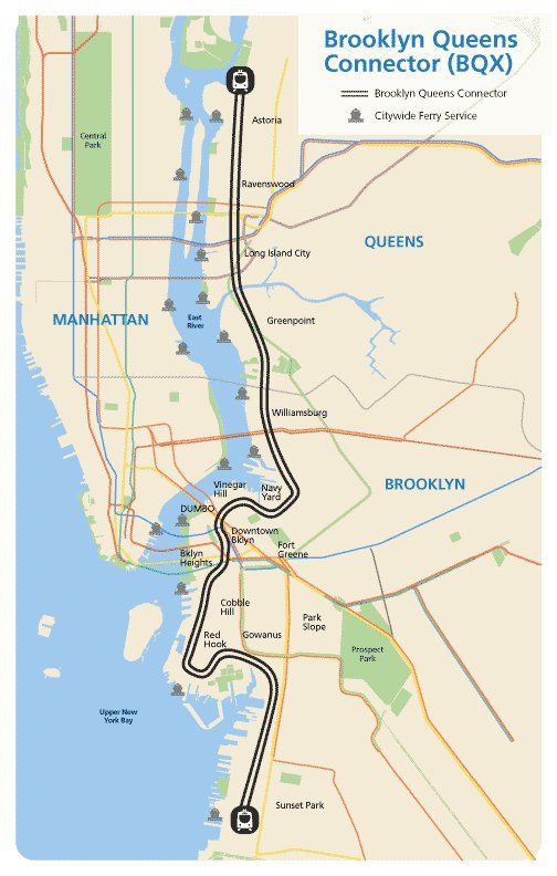
The map makes clear what anybody who has walked around the northern portions of Fort Greene and Clinton Hill already knew: the areas abutting the Navy Yard are bereft of easy subway access.
However, it’s important to remember that the proposed BQX streetcar would run directly through this desert, creating a north-south transit option while also enhancing connectivity to subway stations.
However, there is opposition to the BQX from some residents who see it as a handout to developers or as solving a problem that Select Bus Service could answer just as easily and at far less cost.

