Here’s A Picture Of Homeownership In Ditmas Park

The US Census Bureau released a new mapping tool in December that allows curious website users to navigate trends in median household income, owner-occupied housing, age, education and employment status, and more across the country based on data from the 1990, 2000, and 2012 Censuses.
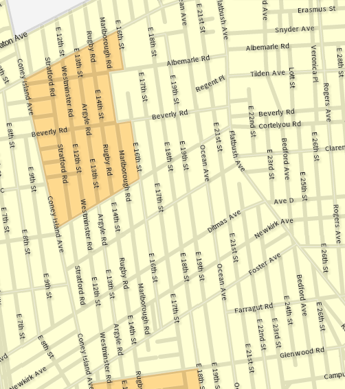
The screen grab above shows where people in the neighborhood owned their homes (in dark orange) vs rented (light orange) in 2012. Out of our entire coverage area, Census Tracts 1522 (chunks of Prospect Park South and Beverley Square West) and 528 (chunks of Fiske Terrace and West Midwood) were the only areas in which over 45% of people owned their residences, according to the most recent Census data.
Of course there are houses rented instead of owned, blocks with more and larger apartment buildings than houses, and different amounts of rental tenants in each–but given the architectural layout of areas like Ditmas Park proper and Ditmas Park West, we might have expected the map to show a few more dark spots.
Those two tracts are also the only ones in our area where the median household income is over $75,000, and Census Tract 1522 also happens to be the only place where over 20% of the population is 65+ (not including Census Tract 494, which is a bit over the Kensington border).
The area with the absolute highest income is Census Tract 1522, which brings in a median of $85,833 per household, per year–and which butts up to Census Tract 506 (Church Avenue to Caton Avenue from Coney Island Avenue to Saint Paul’s Place), where the median household income is $34,255 per year.
In fact, the area bordering Census Tract 1522 with the next highest median income is Census Tract 526 (Coney Island Avenue to Argyle Road and Cortelyou Road to Foster Avenue), clocking in at $54,981–over $30,000 less per household, per year. Similar gaps occur at the borders of Census Tract 528 as well.
Fall down the rabbit hole of these maps yourself (colors may vary on your map, but statistics will remain consistent), and then tell us–can you see a distinct population line where you live vs just outside of it? Is there a clear separation between the amenities, security, and sanitation in your neighborhood vs the one a block over? And overall, what do the maps and statistics indicate to you as a homeowner, someone looking to buy, or even a renter in or on the border of areas with such income, age, housing, and other disparities?