The Commute: A History Of Street Signage – Part 3 Of 3
THE COMMUTE: Last week, we discussed the switch to condensed and light (or thin) font along with the switch from uppercase to uppercase and lowercase lettering. While uppercase and lowercase lettering may increase sign legibility of the street name, legibility of the street suffix often suffers if a two-line format is used. The switch to uppercase and lowercase was well publicized, but the switch to narrow and / or thin font was not.
DOT’s Obsession With Using A Narrow Or Thin Font
There is certainly no shortage of space on the new oversized signs that began appearing at major intersections several years ago. However, DOT has decided to switch to a thin font on those signs also. Compare the reduced visibility on the new signs versus the older signs.
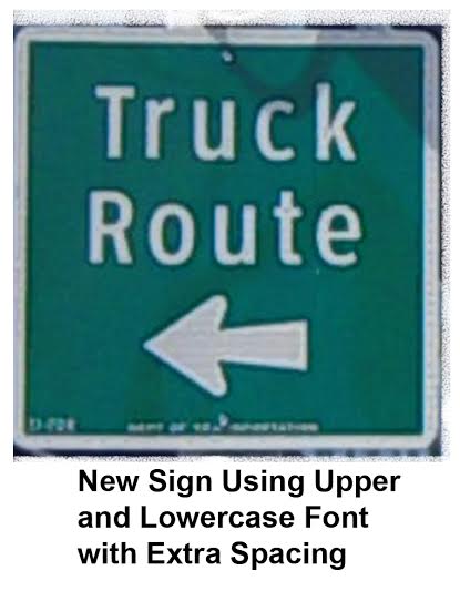
Also, look at the new truck route sign recently installed near Marshall’s department store. A thin font is also used where there is no space constraint, making the sign less visible. Thin or Narrow fonts only make sense when the alternative is printing the street sign in a smaller font using the less visible two-line format.
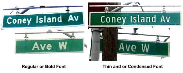
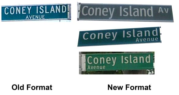
The Case Of Coney Island Avenue
The old signs used the two-line format. Three new variations of the newer signs have been installed. The narrow font one-line format uppercase and lowercase was an improvement. However, DOT decided to revert to the less readable two-line format and could not even be consistent there, using both right and left justified signs for the word “Avenue,” which cannot be seen from a moving vehicle.
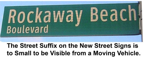
Sign Visibility
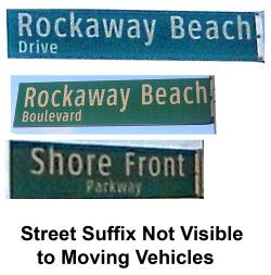
The biggest problem with the upper and lowercase signs is being able to read the street suffix from a moving vehicle with the two-line format. One can argue that seeing the letters “St” or “Av” is not that important. However, what if it is another word such as “Boulevard” or “Parkway?” The examples below also cannot be seen from a moving vehicle. Why did DOT also change the suffix to upper and lowercase to reduce visibility?
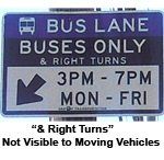
However, ensuring that signage can be easily read from a moving vehicle has never been DOT’s strong point. Look at the “Buses Only” sign in Staten Island. The words “& Right Turns” can only be read (with difficulty) when standing still, but it is designed to be read while you are moving.
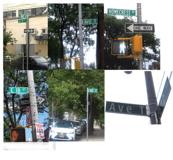
On non-arterial roads, the older signage is more visible from a greater distance than the new signage that uses condensed lettering and extra spaces between the letters. All the old signs can be easily read from a distance, but not the new one in the lower right hand corner.
Co-Named Streets
Visibility is even a larger problem on co-named streets when three lines are used. DOT can’t even decide if the co-name should be above or below the real name of the street, leading to further confusion when the real name falls off leaving only the co-name for years and years, such as on Sheepshead Bay Road.
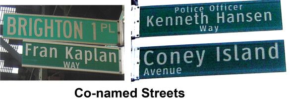
They also switched the suffix from a readable uppercase to a non-readable lowercase. The Fran Kaplan sign is an older lowercase sign. Look how much more visible it is than the lowercase “Way.” Better yet, a different color or smaller sign should be used for co-named streets since they are only meant for pedestrians. A motorist is only interested in signs that help them get where they are going.
A Waste Of Money
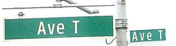
As I pointed out in an earlier article, DOT is wasting money by replacing new pedestrian street signs alongside the oversized signs designed for vehicles. Look at the two new Avenue T signs, both in using harder to read narrow font and extra spacing between the letters. Why can’t pedestrians look at the same signs designed for motor vehicles? Will the oversized letters hurt their eyes?
At the same time, there are numerous faded signs that still have not been replaced.
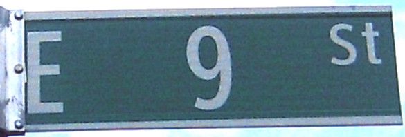
One cannot even argue that narrow lettering is used to save money by printing signs that are shorter in length. Look at all the wasted space on the East Ninth Street sign using narrow font. Notice how the “E” abuts the end of the sign, making it very difficult to read, although there is plenty room on the sign for regular lettering.
Conclusion
It is not whether the sign is all uppercase or uppercase and lowercase that determines legibility, but rather the type of font (which we have not discussed here), if the font is a regular, bold, narrow or thin typeface, and the size of the type. The larger the type, the more readable a sign is and a one-line sign is preferable to a two line sign even if it means using narrow or condensed letters. A light (or thin) font should never be used.
Yet, DOT uses two lines when one line does just fine. Look at the Kensington Street and Coney Island Avenue examples. They are also using more thin and narrow fonts, not only on street signs but other signs as well. The goal certainly cannot be increased visibility.
Additionally, the use of lowercase for the street name suffix on two line signs does not work at all and cannot be seen from a moving vehicle as required. You should not have to come to a complete stop to read a street sign. That is dangerous. Two-line street names should only be used when absolutely necessary.
Narrow letters should never be used when regular or even bold-sized letters will fit on the sign. While promising increased legibility, DOT has not only switched to uppercase and lowercase, but quietly has also switched to exclusively narrow and thin fonts on the new signs currently being installed.
This is especially ridiculous on signs with only a few letters or numbers such as lettered avenues or streets. Adding extra spacing between the narrow letters increases legibility slightly, but the letters should not be narrow in the first place when the names are short.
Installing duplicate signage while faded signage is not replaced is a waste of money.
It also appears that the mayor is using the tactic of reduced sign visibility to slow down cars while at the same time promising increased sign visibility.
The Commute is a weekly feature highlighting news and information about the city’s mass transit system and transportation infrastructure. It is written by Allan Rosen, a Manhattan Beach resident and former Director of MTA/NYC Transit Bus Planning (1981).
Disclaimer: The above is an opinion column and may not represent the thoughts or position of Sheepshead Bites. Based upon their expertise in their respective fields, our columnists are responsible for fact-checking their own work, and their submissions are edited only for length, grammar and clarity. If you would like to submit an opinion piece or become a regularly featured contributor, please e-mail nberke [at] sheepsheadbites [dot] com.