Imagining Life Inside The New Rentals In Brooklyn – Conversation With Interior Designer Lisa Galano
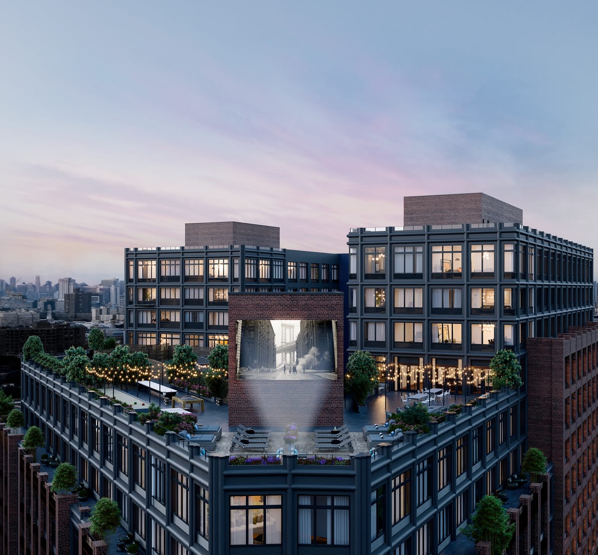

FORT GREENE – When one thinks rental in Brooklyn, one rarely thinks of getting to rent at a building that offers amenities akin to luxury hotels. However, that seems to be the trend for most new developments situated downtown and nearby, most of which also tend to offer a few units through affordable housing lotteries. New rental buildings offer rooftop lounges with great views, pools, firepits, gyms, BBQ spots and libraries, all for the residents to share, promising a different kind of apartment living.
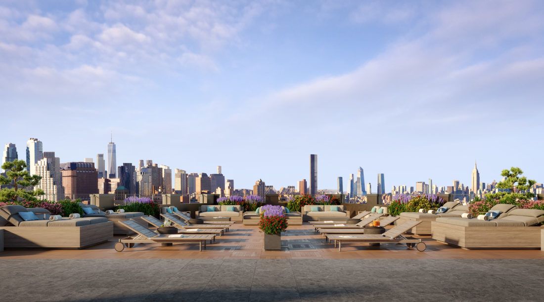
475 Clermont in Fort Greene is the latest such rental building to hit the market, and we decided to talk to the person who was charged with decorating the model apartments, interior designer Lisa Galano of eponymous design consultancy LGDC about what it’s like to imagine living in the building.
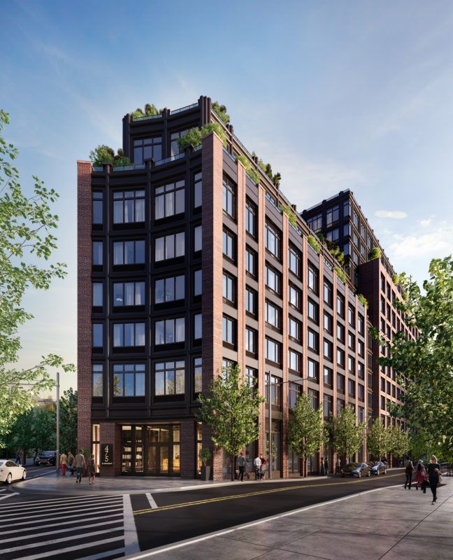
Designed by Aufgang Architects, the building offers of 363 residences – a mix of studios, one- and two-bedroom apartments – spread over 12 floors. Like most new residences, apartments are not large, but in this case, that seems to be offset by generous storage in all units, 11-foot ceilings, and large windows.
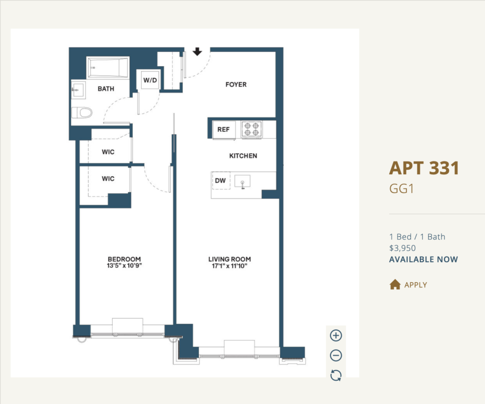
Lisa Galano transformed four of the residences into model apartments, showing what could be done by prospective residents to make the apartments feel more like their home. She was also responsible for some of the fixtures, furniture, and equipment (FF&E) choices for some of the many common areas – the building offers children’s playroom, business center, lobbies, interior, and exterior lounges and the exterior courtyard on the 2nd floor.
The main interior designer for the development, Durukan Design, had already executed materials, layouts, and plans, so Ms. Galano worked around the existing palette and elements like cabinetry in the model units. The goal, she says, was to maximize the space and show how beautiful and functional the units are. Ms. Galano’s other projects include 53W53 (the residences above MoMA), high-end restaurants, hotels, and private homes.
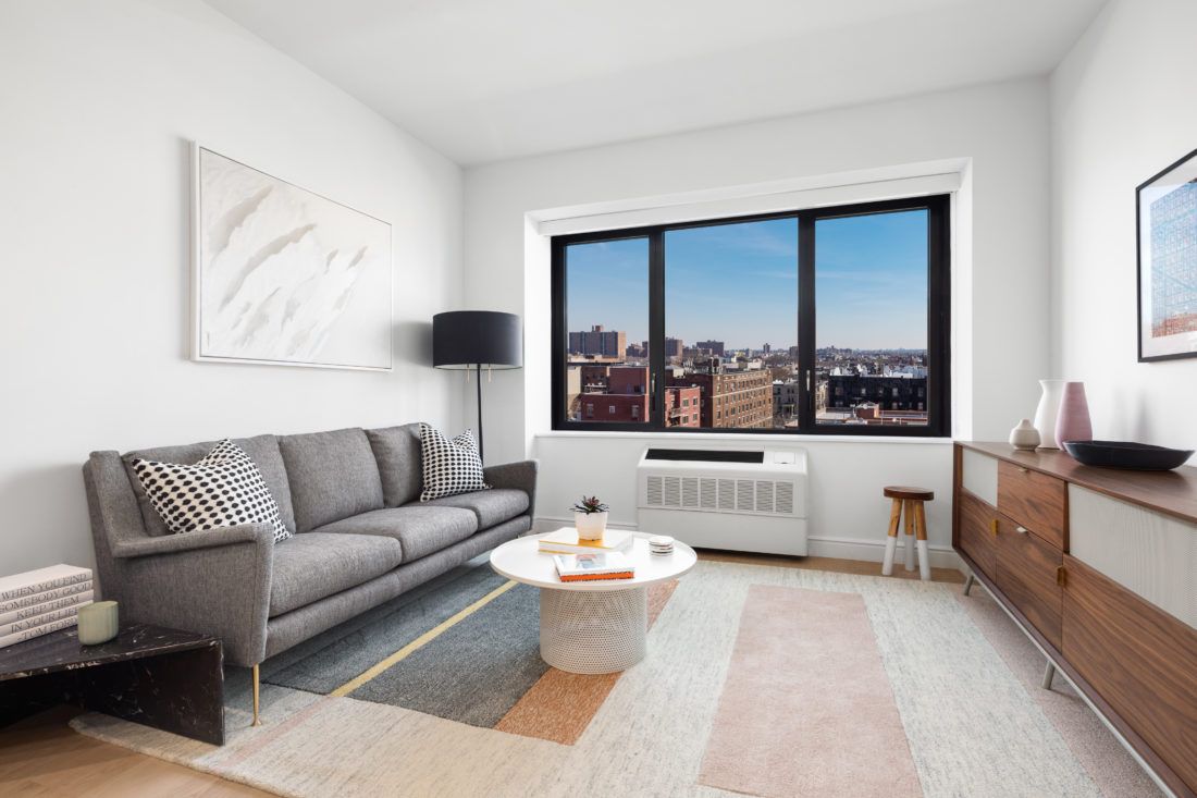
How did you think about designing the model apartments for the rental units? You said the goal was to give the impression of spaciousness.
To me, the units do not seem small. The windows let in an immense amount of natural light, which is amazing. The way they have been functionally laid out, I think, is very efficient and thoughtful. Unlike condos, they allow for impermanence, so when furnishing we focused on creating light and cozy spaces, showing what can be accomplished switching out a light fixture or changing the paint color – connecting the dots for potential residents, so to say.
The challenge for rental units is to feel like home, so we focused on natural light, bringing in warm textures via upholstery, cozier, nubbier textures rather than leather; large rugs, and art. We are trying to show that a unit can be home for a long time.
Part of the goal is to give potential renters ideas for how and where to store their belongings – how to use credenzas, wardrobes, and dressers efficiently. Even in the studio apartments, there is a lot of storage space.
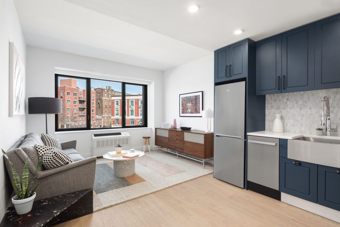
Tips for renters on how to make a rental feel like home?
- Start literally from the ground up. Put down appropriate size area rug (max out!), and make sure that the sofa is the right size. Attention to scale should be the No 1 priority – or things will feel out of place.
- Get creative. Think outside the box about storage – add shelving, add hooks, add a longer credenza.
- Put things on the wall that are important, meaningful to you that are not just family photos. We maxed out on quality art for the model units as well – every piece has a story and it creates a more interesting environment.
Where did you source the furniture that works in smaller spaces?
Blu Dot, Hay, First Dibs, vintage stores – you can almost always find interesting things within a given budget. I love Coming Soon on the Lower East Side, it has lots of variety and is affordable. Article has functional, affordable and quality pieces that don’t feel mass-market. And don’t forget about the importance of art, especially in the neighborhood, check out local galleries!
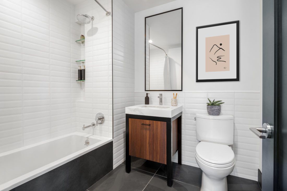
I noticed the absence of TVs in the model apartments.
Use of TVs is declining. People are pulling away from having them in bedrooms for sure, and even in living rooms. It’s ironic – you can get an excellent TV for a few hundred dollars, but it seems we are so connected to the phones and laptops that putting the TV on is not the first thing that comes to mind when you get home. Instead, one may pour a glass of wine, or grab a book and head to an outdoor lounge. Or watch the sunset.
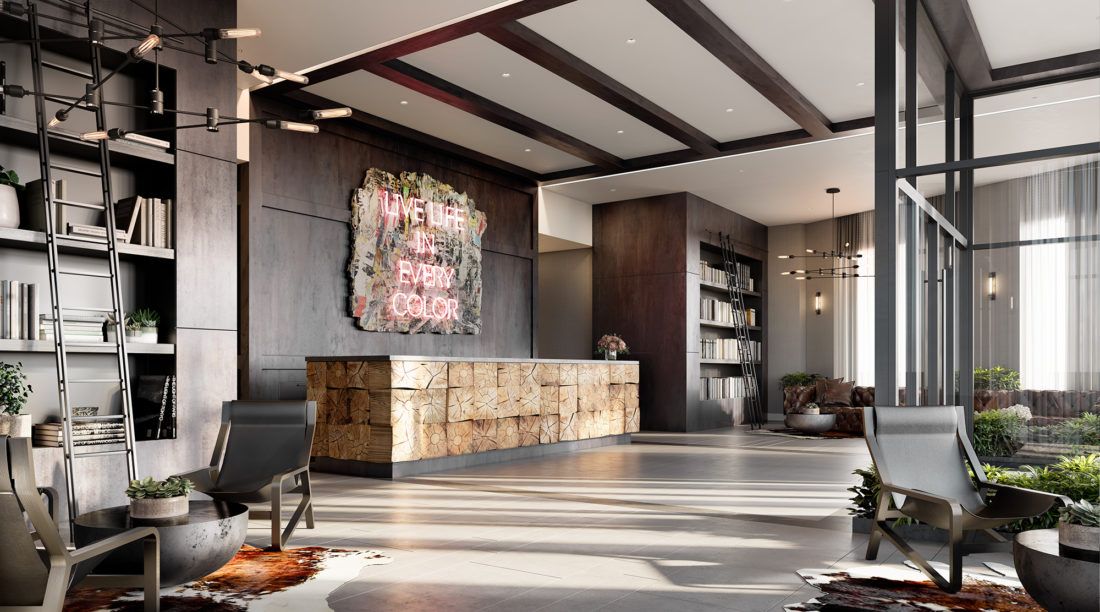
Communal living?
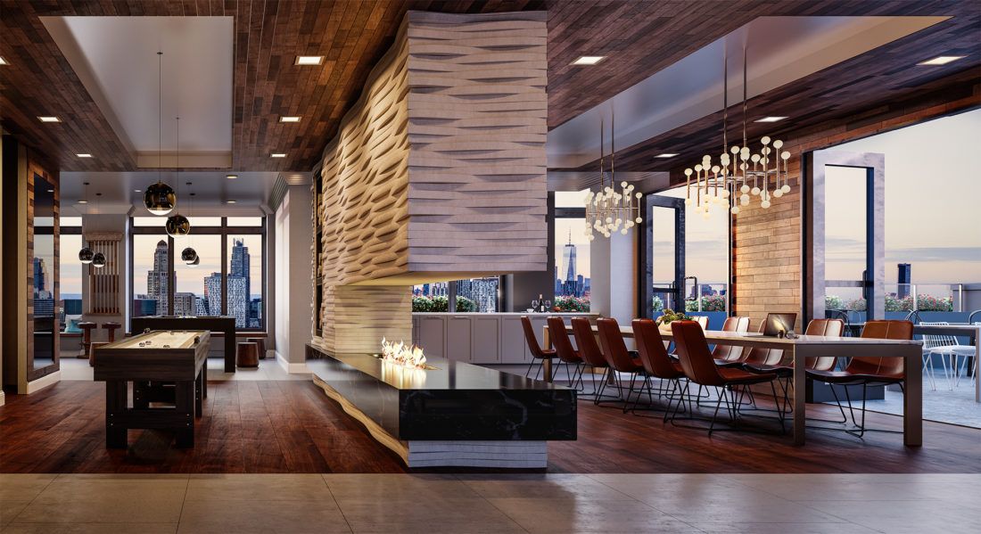
There are so many layers of shared spaces for residents to engage in this building. There is the library area in the main lobby with a curated selection of hundreds of books from Strand, or the 9th floor with BBQs and incredible outdoor dining space, a wonderful children’s playroom with an outdoor area; all allow for options for private and public interactions.
Usually, you get one or two of the amenities in a rental building, not the whole gamut – they afford the residences a sense of community.
What surprised you most about the project?
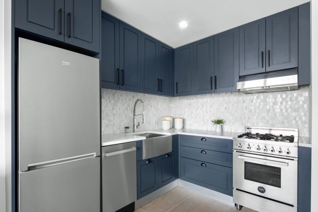
It would have to be the risks the owner [RXR Realty] was willing to take with colors and materials. Bluegreen cabinets, black doors, and light oak floors and large picture windows are more unique than typical rental buildings, and may not appeal to everyone. They [RXR Realty] wanted something more unique, and it made the challenge of decorating the model units a lot more interesting.
If you were to live here, where would we find you?
It would probably be the 9th-floor roof terrace. The 2nd-floor courtyard is very private, has incredible fire pits, Restoration Hardware furniture, so you may also find me there, reading a book.
Updated 5/14/19 to make clearer that Durukan Design is the main Interior Designer of the building, with LGDC responsible for model units and some FF&E elements at the building. All renderings courtesy of RXR Realty.

