Data Exploration: Income Disparities In Our Area


An interesting new map produced by CartoDB user Observatory looks at median household income — and per capita income — by census tract across the U.S.
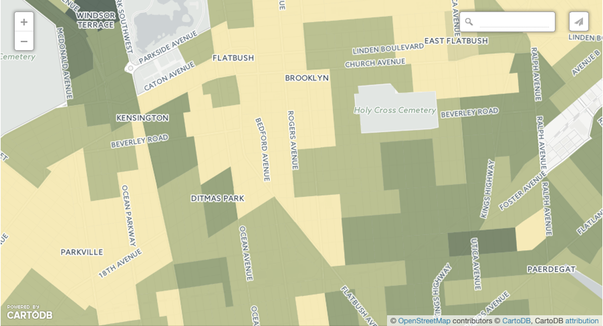
What the data in our area shows pretty starkly is a center of relative affluence in the Ditmas Park and Midwood areas, flanked by columns of lower-income tracts both to the west and east.
Observatory used U.S Census data from 2013 to create the map, which is color coded. The darker the census tract, the higher household income in that area is. Just keep magnifying the map until you can see the streets and blocks that interest you.
Income disparity is not news of course. But what is surprising, perhaps, is the size of the gap (two-fold in the Greater Flatbush area) between households just a few blocks apart.
For example — median household income (MHI) in the area bounded by Church Avenue to Cortelyou Road, and Coney Island Avenue to East 16th Street, is $84,500; while per-capita income in that area is $30,298.
(FYI: I have not yet been able to figure out whether children are counted as part of a household when per-capita income is calculated.)
Once you cross East 16th and start heading east, however, household income drops precipitously.
The MHI in the census tract between East 16th and Ocean Avenue, just south of Church Avenue, is $36,214; while per capita income is $22,103.
The same thing happens when you head west.
The median-household income in the tract immediately to the west of Coney Island Avenue, just south of Church Ave, is $40,380; while per capita income is $18,207.
Take a look at the map and tell us what you see.