The Commute: A History Of Street Signage – Part 1 Of 3

THE COMMUTE: Street signage is as old as New York, first appearing on the sides of buildings, usually in white letters on a dark blue background. It also appeared early on in rural areas at intersections atop a small pole in a crisscross fashion in white on blue or with black lettering on a white background. All signs were in uppercase block letters and were meant to be easily read by pedestrians and by drivers and passengers in slow-moving or stopped vehicles.
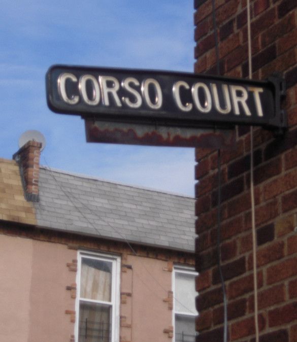
The signs affixed to the buildings were gradually replaced by signs on poles, placed at right angles in heavily populated areas. (That probably explains how the Gravesend sign in the lead picture escaped DOT’s eye in 1970.) As more vehicles used the roadways, more signs were affixed to the taller street lights to be more easily seen from larger vehicles such as trucks and buses.
In the late 1800s and early 1900s, some street signs also displayed the street name you were on in a little oval above the name of the intersecting street. Some cities also showed the address numbers on the block under the street name. That never really caught on in New York City.
As these changes were occurring, and intersections were widening, the size of the print remained the same. In Long Island, many two lane roads that had been widened to eight lanes still have the same crisscross street signs at the corners designed for pedestrians and are totally not visible to moving vehicles, especially at night. Only within the last 10 years has this begun to change with larger overhanging signs.
Styles change and most white on blue signs were replaced with white on black signs probably beginning in the 1930s. However, most likely, in order to make it easier to determine the division between Brooklyn and Queens, where there is no water barrier for most of the boundary, signs in Queens became white on black. Instead of black on white, another probable reason could have been that Queens wanted to retain a closer association with Nassau County, which also chose the white on black signage.
In New York City, in 1970 it was recognized that the size of the lettering designed for pedestrians and horse-drawn vehicles traveling at 10 or 15 mph was too small for today’s vehicles traveling at 30 or 35 mph. Therefore, the hodgepodge of street signage erected during the previous generations was replaced with thinner and larger signs with larger-sized lettering. It was also decided that each borough should have its own color. Since Manhattan had earlier decided to replace its white on blue signage with black letters on a yellow background, it was decided to retain those colors on the new larger signs.
Signs in the Bronx became bright blue with silver letters. It was decided to do the reverse for Queens, using a silver background and blue letters. Brooklyn signage became silver letters on a black background, although few recognized the letters as a silver color and just considered them to be black and white signs. Rather than reversing the colors of Brooklyn signage for Staten Island, for some reason it was decided to use the same colors as in Manhattan’s street signage. Perhaps it was to appease Staten Island politicians so they should believe the city considered Staten Island to be as important as Manhattan.
The new signs proved to be very popular because they were much easier to read and distinguished the boroughs from one another. However, that lasted only around 10 years, when the federal government decided that it wanted all signage to be consistent with the white on green color scheme it earlier decided would be the standard color for all highway signage showing intersecting street names. Blue backgrounds were used on highways to indicate services, and brown backgrounds to indicate recreation. Regulatory signs were in white, and warning signs were in yellow. Everything else was green.
In order to encourage a switch to green, the Feds mandated that if local areas used any color other than green, they would have to foot the bill for the entire cost of sign replacement. That was all it took for New York City to announce that all future street signage would be green.
The new green signs became more predominant, first appearing in the East New York section of Brooklyn in 1981. Then citizens complained that it was just dumb to remove perfectly good signs, which had just been replaced 10 years earlier, just because the color had changed. So it was decided instead to gradually phase in the new green signs as the older ones fell off or faded. Fading had never even been a problem with signs prior to 1970. The new signs were also to be reflective, to make them more visible during nighttime hours.
So now we would have a hodgepodge of old- and new-colored signage, and distinguishing Brooklyn from Queens became a thing of the past. The only guide for the motorist was that if the streets suddenly became numbered, you were now probably in Queens.
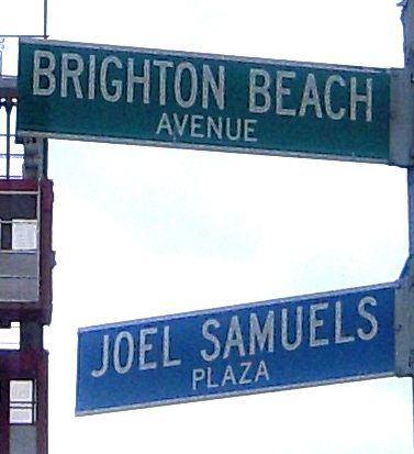
Uniformity and boredom became the norm for street signs, so it was decided that co-named streets, would use the former Bronx colors of white on blue to tell them apart from regular street names.

That was when there were only a few co-named streets before the New York City Council decided to go crazy co-naming hundreds of new streets each year. The city has since decided that co-named streets would also be green.
Also, landmarked and historic areas wanted to be distinguished from the green signs. So the city decided to forego federal funds and install signs with a maroon background for those areas with an “historic” designation in small letters at the top of the sign.
Other small changes also occurred, such as the decision to add a small Statue of Liberty on signs in midtown Manhattan, and place silver borders on the top and bottom to increase visibility. Lower Manhattan had black on white signs installed, which included house numbers and may have been privately funded, as were the large oversized white on blue backlit signs in Midtown.
Except for the Mid-Manhattan signs, all signs remained in upper case letters until last year.
Find out next week what happens as the city decides to switch from all upper case letters to upper and lowercase, and the secrets DOT didn’t publicize, which led to reduced sign visibility.
The Commute is a weekly feature highlighting news and information about the city’s mass transit system and transportation infrastructure. It is written by Allan Rosen, a Manhattan Beach resident and former Director of MTA/NYC Transit Bus Planning (1981).
Disclaimer: The above is an opinion column and may not represent the thoughts or position of Sheepshead Bites. Based upon their expertise in their respective fields, our columnists are responsible for fact-checking their own work, and their submissions are edited only for length, grammar and clarity. If you would like to submit an opinion piece or become a regularly featured contributor, please e-mail nberke [at] sheepsheadbites [dot] com.


