MTA Rolls Out Redesigned “Planned Work” Posters

BROOKLYN – The signs that give many subway-riding New Yorkers a headache finally got a facelift this month.
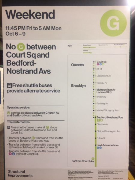
The MTA’s new Planned Work posters are much clearer than previous versions, sporting a visual representation of closures and travel alternatives. They’ll be used in all 472 subway stations.

The new design comes to the MTA via Waterhouse Cifuentes, a design duo that previously worked on brochures for the opening of the Second Avenue Subway in Manhattan.
Our new @MTA Planned Work communication system for the @NYCTSubway goes live today in all 472 stations. pic.twitter.com/IH0cghl71E
— Waterhouse Cifuentes (@yoshibeatriz) August 31, 2017
The MTA emphasized consistency in the upgraded signs, from fonts to colors to layouts. An MTA spokesperson said that goal was to “simplify complex service changes, clarify the duration of service diversions and provide explanations for diversions.”
Riders—and designers—have taken notice of the new look.
Bravo to @MTA on the new Planned Work signs. pic.twitter.com/gRfxgvQ1yg
— Hamish Smyth (@HamishSmyth) October 2, 2017
The MTA also called the new posters “a vital part of Chairman Lhota’s Subway Action Plan, that includes “short-term and long-term actions to improve service and modernize the subways.”
But no matter how clear the information is, one sad truth remains: closures and delays are still rampant on the MTA as the city and state scramble to find a solution to outdated infrastructure and skyrocketing ridership.


