It’s All About Customer Service

THE COMMUTE: Customer service — that should be a top priority for any company and it is for the most successful ones. Adequate signage and responding to customer complaints and taking appropriate action are key components to a good customer service plan. Although the MTA has made significant strides during the past generation in improving its signage and notifications of service changes, it still falls short in some areas. It often ignores customer complaints and suggestions or gives nonsensical or inappropriate form responses.
Regarding signage, the IND provided timetables accurate to the half-minute at major subway stations informing passengers when trains would arrive. The MTA doesn’t wish to burden us with such details and has instead taken the path of simplicity. For example, a typical sign now reads “No B (in an orange bullet of course) Nights and Weekends.” Although useful information, what does one do at 10 or 11 p.m.? How do you know if you missed the last B train or not? I am all for simplicity and clarity, but sometimes functionality should override. While I think the IND went overboard by using half minutes, and that timetables on the stations are not really necessary today, the MTA at least should inform passengers on their signage when the first and last trains are due. “No ‘B’ before 6:20 a.m. or after 10:18 p.m., Mondays through Fridays” is far more useful information than “No ‘B’ Nights and Weekends.”
Sometimes it is difficult for a company to determine the exact wording of the signage because those in charge may be too close to the system to recognize potential problems. That’s where the customer should play a role either through focus groups or surveys.
The MTA rarely conducts either because they are expensive. I reported last year on the MTA’s latest Satisfaction Survey and criticized it extensively because it seemed apparent from the questions asked that the purpose of the survey was to provide a validation for MTA improvements, rather than using it as a mechanism to learn about problems and seek solutions.
Department of Transportation
I have previously written about Customer Service as it relates to the MTA. However, DOT (both state and city) also are guilty of not paying enough attention to customer service. State DOT is responsible for the highway signage, I believe, while the City DOT is responsible for street signage.
It always amazed me why those in charge do not realize how confusing some highway signage in New York City must be for a tourist. For example, if you are going west from the Prospect Expressway toward Manhattan, you cross the Gowanus Canal using I-278 East although you do not change driving direction.
Even more confusing is the lack of signage on the Belt Parkway notifying you of the highway you are driving on. Coming off the BQE going south (or westbound as the signs indicate) following the signage for the Belt Parkway, the first sign you see after you exit the BQE is that you are now on Leif Ericson Drive. You thought you just took the exit for the Belt Parkway, didn’t you?
The next sign you see a few feet further is that now you are on the POW/MIA Highway. What happened to Leif Ericson Drive, you ask yourself, and why aren’t you on the Belt Parkway (which, of course, you are)? How many accidents are caused by last minute decisions due to poorly-worded, misleading, or missing signage, or signage placed too close or even beyond the actual decision point?
The POW/MIA sign is not even placed in the correct location since the POW/MIA Highway is a co-named highway going cross-country starting from Sunrise Highway in Long Island, then along the Belt Parkway, Verrazano Bridge, Staten Island Expressway and on into New Jersey and beyond, never touching the segment of the Belt Parkway where the sign near Exit 1 is located.
A similar problem occurs as you are leaving the Belt Parkway and entering the Cross Island. You never see a sign notifying you that you are on the Cross Island. Instead immediately after the exit for the Cross Island, there is a large green sign notifying you that you now are on the 100th Division Infantry Highway, not the Cross Island Parkway. Am I the only one who sees a problem with this?
Now, I see nothing wrong with co-naming. In fact I like the idea of a POW/MIA Highway connecting many highways across the US. However, using the same signage styling for these co-named highways and failing to provide signage for the commonly used highway names only causes needless confusion. Signage is supposed to clarify, not confuse.
The NYC DOT is just as guilty by not distinguishing co-named street signage from regular street names using an alternate color or typeface. When a sign falls off and is not replaced for years, often the only sign remaining is the sign for the co-named street, as is the case on Sheepshead Bay Road. If a friend called you for directions and told you he was lost and needed directions, would you know where he was calling from if he told you he was at the corner of Emmons Avenue and Lena Cymbrowitz Way, as the signage indicates? Or would that be as useful to you as if he said he was at the corner of “Walk” and “Don’t Walk?”
The New York City Council is co-naming or renaming streets all the time, yet no one sees the need to rename streets for clarification purposes. Do we really need a second two-block Sheepshead Bay Road in Coney Island or a West Avenue a block away from a West Street? Aren’t two West streets in Brooklyn confusing enough? You would think that the so-called experts would see the problems with confusing street and highway signage, but they do not, because they do not put themselves in the place of the tourist or first-time users who rely on signs to guide them.
American Airlines
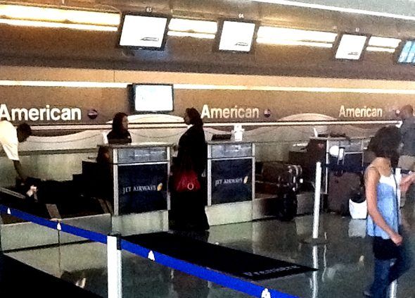
Apparently the MTA and the DOTs do not have a monopoly on the lack of common sense when it comes to signage. It also extends to private industry. You would think that the picture above is one of the American Airlines Counter with all the signs prominently reading “American” and an even larger lit up sign above not in the picture. That’s what my two friends and I thought on Friday while waiting to pick up a boarding pass at JFK for my friend who was returning to Israel.
You are actually looking at the ticket counter for Jet Airways. The American Airlines ticket counters are around the corner and look almost identical except for small Eagle signs instead of Jet Airway signs. So, after 30 minutes of waiting on the wrong line, we naturally complained to American Airlines personnel. The gentleman we spoke to could not understand why there was a problem. It was clear to him that those were the Jet Airways counters. What about all the large “American” signs we asked?
His response: “Oh those. They merely indicate that you are in the American Airlines Terminal. They don’t indicate that this is the American Airlines Counter.” Gee whiz, they fooled us. How could we make such a dumb mistake?
We were then questioned why we didn’t just use the self-service kiosks. The answer was simple. British Airways issued my friend’s ticket to London for an American Airlines flight, and he had a British Airways flight number. He wasn’t sure if the kiosk would recognize it, having had difficulty using it on his trip to the US. An American Airlines official pressed all the buttons for us and we were on our way. But we couldn’t have done it ourselves because the American Airlines flight number showed up on the display — not the British Airways flight number on his itinerary, and that would have confused us.
We asked why they don’t just cover up all those misleading American signs over the ticket counters since you no longer need to know you are in the American Terminal once you are already inside the building. They seem to be there only to confuse you. We were met with puzzled expressions from the two American Airlines personnel we asked. They could not understand why anyone would be confused because they see the signs every day and didn’t put themselves in the place of a first time traveler.
MTA
Signage also has to be appropriate for the intended audience. The MTA for years posted signs in construction zones on subway platforms stating “No Standing – RCA”. How many subway riders knew what RCA stood for? As an MTA employee, I knew it meant “Restricted Clearance Area. When I suggested that it should be spelled out, I received a response that the existing signage was adequate and clear. The following year they started spelling out RCA.
Jay Walder was primarily interested in reducing the deficit. Let’s hope that the next MTA chairman recognizes the importance of customer service and that this recognition spreads to both DOTs and companies like American Airlines. When David Gunn ridded the subways of graffiti, it inspired the city and neighborhood associations to also clean graffiti and not to tolerate it.
The Commute is a weekly feature highlighting news and information about the city’s mass transit system and transportation infrastructure. It is written by Allan Rosen, a Manhattan Beach resident and former Director of MTA/NYC Transit Bus Planning (1981).


