Map Shows Ditmas Park Race Data Based On 2010 Census

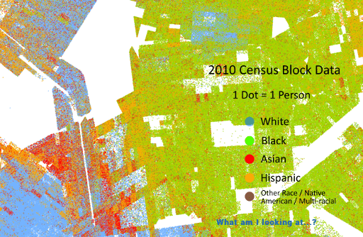
The University of Virginia’s Cooper Center just released a map including one dot for each person counted in the 2010 US Census–a full 308 million dots organized to show the racial makeup of different parts of the country.
Zooming in as much as the map will allow, you can see distinct racial borders of neighborhoods within Victorian Flatbush, as well as which of those neighborhoods are (or were, in 2010) more densely-populated with apartment dwellers vs. areas with single family homes.
It’s interesting to look at our country’s lingering divides in map form–so if you have a moment, scroll around to see how this area compares to different parts of Brooklyn, NYC, and the rest of the country.
Image via the Cooper Center