Let’s Talk Subway And Bus Signage
THE COMMUTE: Last week we discussed DOT street and parking signage. In January we mentioned the lack of clarity of the subway fare signs at the station agent booths. What about the rest of the MTA signage? In this area, the MTA scores rather well, making significant strides since the agency was put in charge of the subways in 1968.
In the 1950s, subway station signage was a hodgepodge of various formats created over the decades by the three subway divisions: the IRT, the BMT, and the IND — two of them formerly private companies. It looked awful and was very confusing, although in some cases more detailed information was given than is today. Signs at station entrances listed major points of interest such as Times Square, Grand Central, South Ferry, Uptown, the Bronx, etc. Today you only get a route number, station name and perhaps a direction if the entrance is not for both directions. Yet it is quite sufficient. When those original signs were printed there were no inter-divisional transfers so listing major destinations was important. Not so much today.
In the 1970s, the MTA unified all the different sign colors, sizes and fonts into the standard system we have today. The tiled stations still have their original style mosaics. Generally, signage works well and has improved greatly. However, there are still a few problems. In their quest to remove superfluous and conflicting information, the MTA oversimplified a bit too much. For example, detailed subway schedule sign information was removed and replaced with approximate service times. That was fine, but then the MTA removed necessary information such as when the first express would arrive and the last one would leave. Now we are left with signage such as “B Weekdays and Evenings.” That really doesn’t help you when you are waiting at DeKalb Avenue and are trying to determine if you missed the last express.
The electronic subway signs in the cars are a great help to tourists and the occasional rider by displaying a wealth of information. They are far more useful than a sign merely stating “Q Broadway Express – 57 Street Manhattan” or just “B Bedford Park Blvd, Bronx.” However, there are still some problems. Sometimes the conductor forgets to program the correct schedule, and you will get announcements instructing you to change for the B on weekends. Also, these electronic signs are supposed to be very flexible to changing conditions, but showed Cortlandt Street as open after it was closed due to 9/11. The new countdown clocks are a separate issue for discussion at another time.
Regarding bus signage, the MTA is responsible for the signs on the buses themselves, and DOT is responsible for street signage. Both also have improved tremendously. When I was a child the signs only said “Bus Stop” with no other information provided for prospective passengers. The electronic bus signs, which first appeared in the early 1980s, were deficient to the roll signs they replaced and cost $3,000 each as compared to the roll signs costing $500 each. They required more maintenance and were not as visible to read. The design of the RTS bus caused the snow to block the signage. Water vapor was also a problem, making the signs unreadable during storms. Today’s signs are larger and much easier to read. They display better information, allowing for more characters and variation in size of upper- and lower-case letters, and are far superior to the old roll signs. Adequate, up-to-date bus information is still lacking at bus shelters, which we discussed a number of times before, but we do have guide-a-ride schedules on the bus stop poles at most locations.
Automated Announcements
I am also displeased with the automated bus announcements, which I find rather annoying. The bus operator should have some control as to when those announcements play. For example, whenever the chime is rung as a passenger wants to exit, an announcement is made instructing passengers to exit through the rear door. Those announcements are ignored since they are played at virtually every stop. Also, if the bus is very crowded, exiting through the rear door may not be possible. It also makes no sense for them to play the announcements near the end of a route when no more passengers will be boarding. If they were used only when necessary, passengers may take heed. Another announcement, to move to the rear of the bus, is lacking in the automated system, and most drivers do not ask passengers to move so that additional passengers can board.
Also, sometimes, just after the announcement to push the tape to exit the bus is played, a second announcement asks you step away from the door, just as you are about to exit. How are you supposed to exit if you cannot get near the door? If it is meant for you to step away from the door after you exit, the wording needs to be changed. Since it does not happen all the time, it appears to be a frequent malfunction, which is quite annoying.
Someone Is Always Unhappy
Recently, the Smith-Ninth Street Station, which had been undergoing reconstruction since the time of Mayor La Guardia, or so it seems, finally reopened. The ends of the station had a tile mosaic, which was not refurbished in time by the contractor for the station opening. The MTA, using some imagination for a change, instead temporarily installed a laminated photograph of the tiled signage. The New York Daily News made this into a story, asking riders’ opinions until they received a negative response that a blank space would have been preferable to a paper sign. I disagree. The goal here is to provide the information and the MTA adequately did this. A reporter called me once asking for a comment about the MTA. He was hoping for a negative one. When I stated something positive, he found someone else to quote who had a negative comment. Obviously, the goal was to sell papers; negative comments about the MTA sell more papers.
When Temporary Becomes Permanent
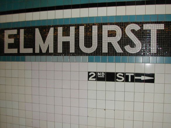
The only problem with temporary signage is when it becomes permanent. I once noticed how replaced subway tiles resulted in the wrong information given. (See picture above.) The sign in the tile originally said “82 ST.” At some point in time, a portion of the tile was replaced and the number 8 tile was removed, resulting in passengers being directed to “2 ST” instead. I notified the MTA and was informed that an “8” would be temporarily stenciled on the tile and a new permanently embossed tile would be ordered and replaced within three months. Six months later the stenciled tile was still there. Today, nearly 10 years later, the stenciled tile is mostly worn away and the sign again directs passengers to either “2 ST” or “32 ST.”
Bureaucracies Never Admit Mistakes
When the MTA adopted their standard signage in the 1970s, one problem was the designer’s insistence to place all arrows to the left of the words and other symbols. This was very confusing if the destination was on the right because it resulted in the arrow pointing to the words rather than the place you were being directed to. It was a classic case of aesthetics superseding functionality. The MTA never admitted the confusion the new signs caused, but quietly corrected the problem decades later.
A similar problem occurred with DOT. More than a decade ago, the DOT began replacing bus stop signs with a more updated design. These were affixed on sturdier signs, which were, presumably, less likely to be knocked down in a traffic accident. The problem was that the new signs were placed 18 feet in the air and not easily visible since one had to crane one’s neck to read the information. Despite numerous complaints from bus riders and elected officials, DOT insisted the height was correct. However, newer signage was placed at a height of only 12 feet.
In 2003, I recommended that DOT lower the signs showing the bus stop name to seven feet (I assume these signs are for people getting off the bus. Someone waiting at the bus stop does not need this information). I realized these signs are only visible to seated passengers. If they were lowered, standees would be able to read them as well. My suggestion was declined. The reason given was that seven feet was too low and unsafe for pedestrians and a height of 10 feet or higher was necessary. The problem with that logic was that, at stops where four or more routes terminated, the bus stop names were already at a height of seven feet and were considered safe. How I just love receiving conflicting and illogical responses from bureaucracies.
The Commute is a weekly feature highlighting news and information about the city’s mass transit system and transportation infrastructure. It is written by Allan Rosen, a Manhattan Beach resident and former Director of MTA / NYC Transit Bus Planning (1981).
Disclaimer: The above is an opinion column and may not represent the thoughts or position of Sheepshead Bites. Based upon their expertise in their respective fields, our columnists are responsible for fact-checking their own work, and their submissions are edited only for length, grammar and clarity. If you would like to submit an opinion piece or become a regularly featured contributor, please e-mail nberke [at] sheepsheadbites [dot] com.