Interactive Map Breaks Down Household Incomes Block By Block
There’s already a lot we know about incomes in our corner of Brooklyn: folks in Manhattan Beach tend to do pretty well, Sheepshead Bay is solidly middle-class, and Gerritsen is somewhere between the two.
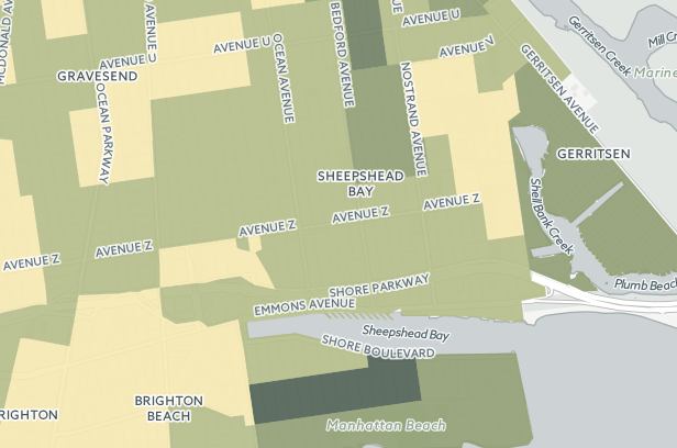
However, a new interactive map published on CartoDB, the online mapping tool, by user Observatory, uses 2013 census data to create a visualization of median household incomes throughout the United States. Zoom in on our neighborhoods, and you start to see how your income compares to neighbors a few blocks away.
The map, which is color-coded to reflect income levels, reveals surprising salary disparities in some parts of our neighborhood.
For instance, those living close to the Sheepshead Bay subway station have some of the neighborhood’s lowest incomes — making barely more than $30,000 a year — though that may change when those condos start selling for $700,000 in the Voorhies Avenue tower. Meanwhile, our neighbors in the Sheepshead Bay/Nostrand Avenue make an average of $13,111 per household, well below Brooklyn’s medium income level.
The data also shows that Manhattan Beach’s wealthiest residents are concentrated in a narrow strip that runs through Oriental Boulevard and Hampton Avenue. There’s also a little patch in Sheepshead Bay, above Avenue V and between East 26th Street and East 29th Street, where people appear to be have higher incomes than the rest of the neighborhood.
It’s definitely a cool map if you’re interested in getting a fuller picture of income levels in your area. Play around with it and have fun.