Graph of Subway Service Changes Shows the Q Isn’t Too Great

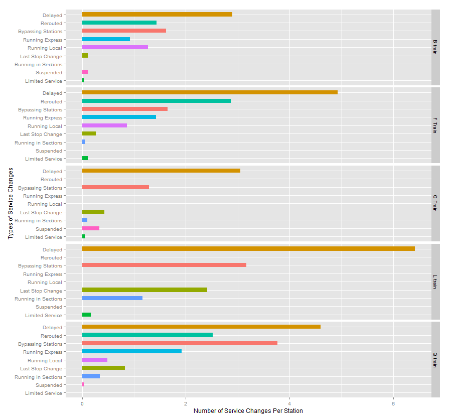

Sitting down to see if the G train is as bad as he thinks, Alex of Hot Cashew charted two years of subway service change announcements that are sent as Tweets. He then divided the number of incidents by the number of stations serviced, and the results are shown in the chart above, with the Q train results displayed on the bottom.
The Q train averaged over 4 delays per station, coming in third compared to nearly 5 for the F train and 6+ for the L train. But the Q topped the average for bypassing stations, and was runner up for being rerouted.
Last year the Straphangers Campaign looked at simliar data and found that there were 170 controllable delays (things like signal or mechanical problems, as opposed to delays such as police activity or sick passengers) on the Q train in 2011 – compare that to the 2 train, which had the most with 251 incidents.
Basically, the Q train doesn’t come out well when you look at all the delays. How do you think it stacks up?
Chart via Hot Cashew