The Commute: A History Of Street Signage – Part 2 Of 3
THE COMMUTE: Last week, we took a brief look at the history of New York City’s street signage, which, traditionally, has been all uppercase. Several years ago, studies were conducted that showed, supposedly, that the use of upper and lowercase lettering is more visible than uppercase. Perhaps since we now live in an internet society, in which the use of uppercase letters is considered tantamount to shouting, we made the switch to lowercase.
I do not believe that upper and lowercase letters are easier to read. There are several disadvantages to using upper and lowercase letters as opposed to all uppercase. This is especially true when using sans serif fonts. Sometimes lowercase i’s can appear to look like lowercase l’s if there is too small a space between the dot and the base of the letter. There is also no distinction between a capital I and a lowercase l. For example, in the name “Illinois,” you have what appears to be three of the same letter adjacent to one another.
These are minor problems. The biggest problem with using upper and lowercase letters within a constricted space, such as on a small sign, is that some of the letters go above and beneath the guidelines, meaning that a smaller-sized font must be used, and smaller fonts reduce visibility. The most important factor in determining visibility of a sign is not that the letters are uppercase, or uppercase and lowercase, but the size and width of the fonts.
Given the same size fonts and font widths, I don’t doubt that uppercase and lowercase fonts are more visible. However, a straight change from uppercase to uppercase and lowercase is not what the DOT has done. They also have switched from a regular font to a condensed or narrow font, making the newer signs less visible than the older signs — not more visible as originally promised.
They did this not only on the new street signs, but also on the new parking signs, which started appearing last year, which I reviewed here. To achieve additional white space and give the new parking signs a less cluttered look, the font size was also reduced and a narrow font was used requiring one to be up close to the sign to be able to read it, rather than be at a 40-foot distance from the sign.
Condensed Font
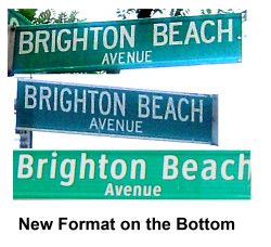
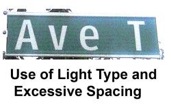
Before we discuss the new signage, let’s look at what a condensed font is, which I shall refer to as a “narrow font.” Its narrower letters permit words to take up less space. It is necessary when long words need to be spelled out because the sign would become too long if a regular font was used. The alternative is to use a smaller font on two lines and use regular-sized letters. Given the two choices, a condensed font is the better alternative. Compare the two Brighton Beach Avenue signs and the new one in upper and lowercase. The problem with the new sign is that the street suffix in lowercase is less visible. However, in the case of a short sign, for example, Avenue T, it makes no sense to use a condensed font because the sign is capable of spelling out the entire sign using regular sized letters.
Light Font
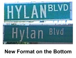
The DOT has also started using “light” or thin fonts to save space when extras space is not needed and then doubled the spacing between letters.
That decreases visibility over normal or bold lettering and standard spacing. So the use of condensed fonts has traditionally been used on long signs with long street names, in which the suffix “Avenue” is abbreviated “AV” and a smaller font is used. On even longer signs, such as Brighton Beach Avenue, the street name is placed on two lines and the suffix is spelled out in an even smaller font. Light fonts have never been used. However, on the Hylan Boulevard signs pictured above, the DOT is using both a light and thin font. The reduced visibility over the regular font with capital letters is readily apparent.
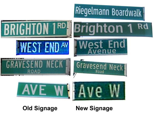
That is not to say that condensed font doesn’t work well some of the time. In the signs above, both new and old are quite visible, except for the new Avenue W sign, which is less visible than the “all caps” version. The others are a tossup and the word “Avenue” is quite readable after “West End.” The old boardwalk signs were of the two line variety as in “Neck Rd” and the new signs are much more visible. The problem is that the font used on that sign and on the “Brighton 1ST Rd” sign are no longer being used. All signs now being installed resemble either the new Neck Road or Avenue W signs.
The Lack Of Consistency
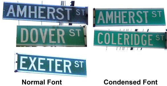
The DOT has never been consistent with its street signage. They used both regular and condensed fonts on the old Brighton Beach Avenue signage. Also, a look at the old signage in Manhattan Beach shows they used regular and narrow fonts interchangeably. Exeter Street was printed in regular font, although Dover Street, which has one less letter in it, used a narrow font. Amherst Street uses both types of lettering. The narrow font is clearly less readable.
On Kensington Street, there are only four signs, but each one is different. There are two old signs, one in narrow font and one in narrow font with extra spacing between the letters. On the two new signs, the first uses uppercase and lowercase narrow fonts, and the other uses regular, but in the two-line format. Which sign do you find to be the most readable, considering only the lettering style? (Note: The day the picture was taken and the age of the sign can affect the sign coloring and brightness.)
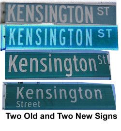
I prefer the first old sign without the extra spacing. The upper and lowercase sign is also very readable except for the street suffix, which is difficult to read in uppercase and lowercase.
The Switch To Uppercase And Lowercase
At first, I had no problem with the switch. The new signs seemed just as easy to read as the uppercase signs or perhaps even more readable, as promised. Then DOT switched from a regular or bold font to a thin and or narrow font, not only where it is necessary because the street name is long, but also where very little information needs to be displayed, such as on a numbered sign. Look at how much clearer the regular or bold “8” is as compared to the narrow “8” and “9.”
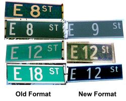
Look how much less visible the thin East 12th Street lettering is as compared to the initial installation of the lowercase sign, which used a bolder font than the older signage. Comparing the two East 12th Street signs on the same line, the newer sign is more preferable. But what happened? Apparently DOT decided that increased visibility was a bad thing and decided to switch to the least visible signage using a thin font, such as used in the last East 12th Street sign. Is it that they believe poorer signage will encourage slower speeds?
Next Week: More about the decreased legibility of the new signage.
The Commute is a weekly feature highlighting news and information about the city’s mass transit system and transportation infrastructure. It is written by Allan Rosen, a Manhattan Beach resident and former Director of MTA/NYC Transit Bus Planning (1981).
Disclaimer: The above is an opinion column and may not represent the thoughts or position of Sheepshead Bites. Based upon their expertise in their respective fields, our columnists are responsible for fact-checking their own work, and their submissions are edited only for length, grammar and clarity. If you would like to submit an opinion piece or become a regularly featured contributor, please e-mail nberke [at] sheepsheadbites [dot] com.